Bubble map chart
(quoted from Proportional Symbol Map definition in Wikipedia)
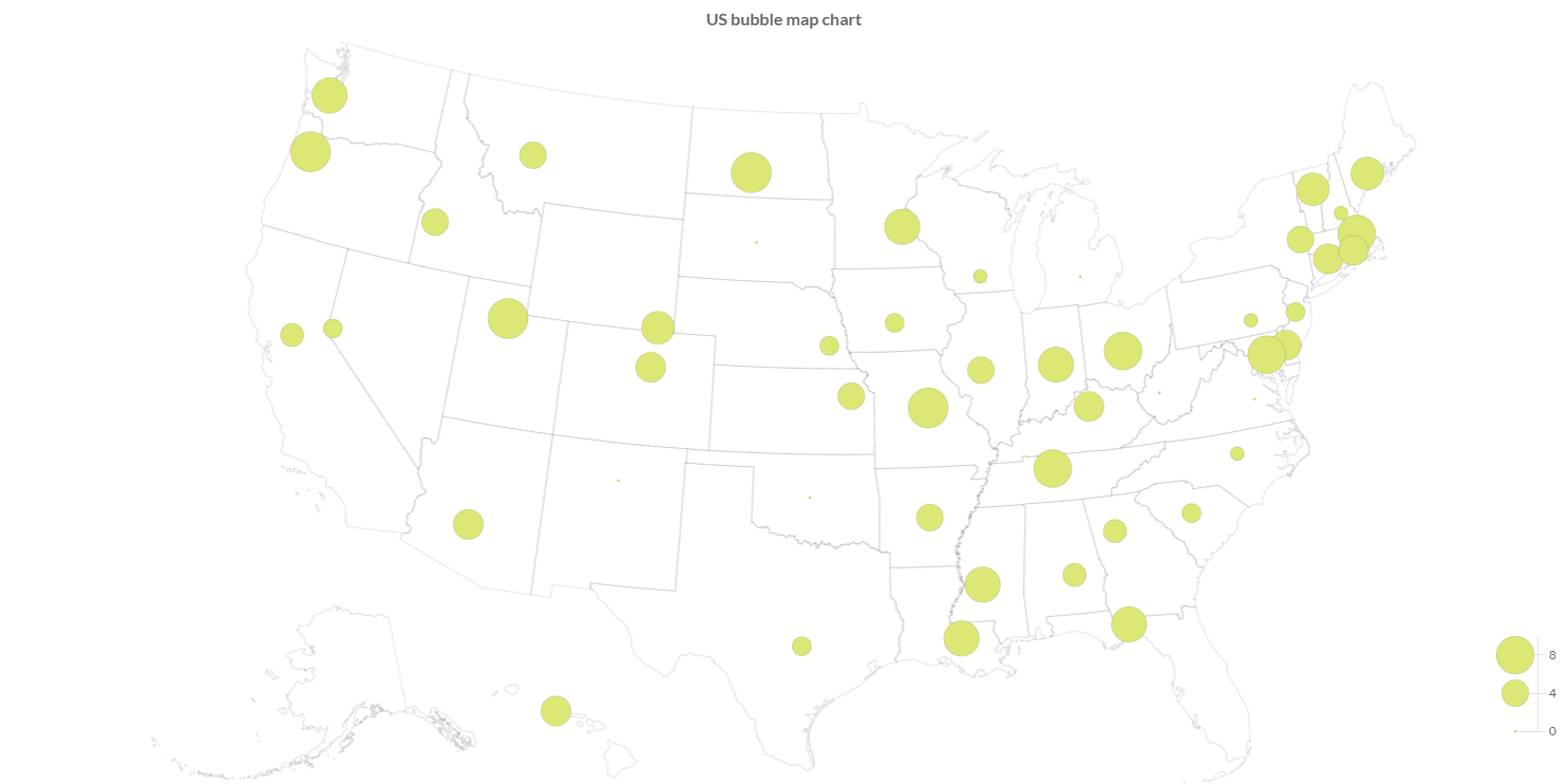
A Bubble Map (or Proportional Symbol Map) is a type of thematic map that uses map symbols that vary in size to represent a quantitative variable. For example, circles may be used to show the location of cities within the map, with the size of each circle sized proportionally to the population of the city.
It is a map chart type that uses the visual variable of size to display differences in the magnitude of a certain discrete, abruptly changing phenomenon.
Programmatically, you could use a bar chart as following:
// creates the chart
BubbleMapChart chart = new BubbleMapChart();
// adds to DOM
component.add(chart);
...
// example for Elemental2
// gets the chart instance as DOM element
Element element = chart.getChartElement().as();
// adds to DOM
DomGlobal.document.body.appendChild(element);
By UIBinder (ONLY for GWT), you could use a bar chart as following:
<ui:UiBinder xmlns:ui="urn:ui:com.google.gwt.uibinder"
   xmlns:g="urn:import:com.google.gwt.user.client.ui"
   xmlns:c="urn:import:org.pepstock.charba.client.gwt.widgets">

   <g:HTMLPanel  width="100%">
      ....
      <c:BubbleMapChartWidget ui:field="chart"/>
      ...
   </g:HTMLPanel>
</ui:UiBinder>
Dataset
The bubble map chart allows to define the data and a number of properties, used to display the data, by a bubble map dataset.
Every chart has got a method to create a typed dataset accordingly with the chart type. The dataset can be also created instantiating the constructor.
// creates the chart
BubbleMapChart chart = new BubbleMapChart();
// creates the dataset
BubbleMapDataset dataset = chart.newDataset();
// sets the option
dataset.setBackgroundColor(HtmlColor.RED);
dataset.setShowGraticule(true);
...
// creates the dataset
BubbleMapDataset datasetNew = new BubbleMapDataset();
// sets the option
datasetNew.setBackgroundColor(HtmlColor.RED);
datasetNew.setShowGraticule(true);
...
// sets the dataset to the chart
chart.getData().setDatasets(dataset);
The following are the attributes that you can set:
| Name | Type | Default | Description |
|---|---|---|---|
| clipMap | boolean - ClipMap | ClipMap.TRUE | Whether to clip the rendering to the chart area of the graph or to another area. |
| outline | Feature[] | [] | The features used to scale and centralize the projection in the chart area. |
| showGraticule | boolean - Graticule | false | If enabled it by true or graticule object instance, it renders the lines in the background. |
| showOutline | boolean | false | If true to render the outline in the background |
Styling
The style of the dataset can be configured by bubble map point, which extends a Point elements, as following:
| Name | Type | Default | Description |
|---|---|---|---|
| graticuleBorderColor | String - IsColor | rgb(204,204,204) - | The graticule border color. |
| graticuleBorderWidth | int | 0 | The outline border width. |
| outlineBackgroundColor | String - IsColor | null | The outline background color. |
| outlineBorderColor | String - IsColor | Defaults.get().getGlobal().getBorderColorAsString() | The outline border color. |
| outlineBorderWidth | int | 0 | The outline border width. |
// from chart instance
BubbleMapPoint bubblemapElement = chart.getOptions().getElements().getBubbleMapPoint();
// sets options for bubble map datasets of the chart
bubblemapElement.setOutlineBorderWidth(3);
bubblemapElement.setGraticuleBorderColor(HtmlColor.RED);
...
Data structure
Bubble map dataset needs to contain a data array of points, each data point has to contain the latitude and longitude of the point to render and containing the value for the coloring.
Bubble map data points are mapped by ChoroplethDataPoint.
// creates data points container
List<BubbleMapDataPoint> dataPoints = new LinkedList<>();
// creates a data point
BubbleMapDataPoint dp = new BubbleMapDataPoint(latitude, longitude, 20);
// adds data points
dataPoints.add(dp);
// sets values by an list of data points
dataset.setValues(dataPoints);
The setData and setDataPoints methods are available, inherited by the bubble dataset, but you can NOT use them otherwise an exception will throw.
Use setValues instead.
Options
The bubble map chart defines specific options implementation to be configured.
// creates the chart
BubbleMapChart chart = new BubbleMapChart();
// gets the chart options
BubbleMaOptions options = chart.getOptions();
// sets option
options.setResponsive(true);
These are the options specific to bubble map charts:
| Name | Type | Default | Description |
|---|---|---|---|
| clipMap | boolean - ClipMap | ClipMap.OUTLINE_GRATICULE | Whether to clip the rendering to the chart area of the graph or to another area. |
| outline | Feature[] | empty list | The features used to scale and centralize the projection in the chart area. |
| showGraticule | boolean - Graticule | false | If enabled it by true or graticule object instance, it renders the lines in the background. |
| showOutline | boolean | false | If true to render the outline in the background |
The bubble map chart disables the legend component and the options can NOT be set globally but only at chart level.
Scales
A bubble map chart can have maximum 2 scales, of the following types:
- Projection scale which defines a way to flatten a globe's surface into a plane in order to make a map.
- Size scale which is used to map the values to symbol radius size.
Projection axis
A Projection axis is managing the map projection.
A map projection is a way to flatten a globe's surface into a plane in order to make a map.
This requires a systematic transformation of the latitudes and longitudes of locations from the surface of the globe into locations on a plane.
Here is an example how to create a projection axis:
// creates the chart
BubbleMapChart chart = new BubbleMapChart();
// creates a projection axis
// scale id and axis kind are already defined
ProjectionAxis axis = new ProjectionAxis(chart);
// adds axes to chart configuration
chart.getOptions().setAxes(axis);
Options
The projection axis allows to define a number of properties, used to display the data.
// creates a projection axis
ProjectionAxis axis = new ProjectionAxis(chart);
// sets options
axis.setProjection(Projection.EQUAL_EARTH);
axis.setProjectionScale(0.5);
axis.setProjectionOffset(0, -50);

Projection projection = axis.getProjection();
The following are the attributes that you can set:
| Name | Type | Default | Description |
|---|---|---|---|
| padding | Padding | 0 to all dimensions | Sets padding applied during auto scaling of the map in pixels, i.e. the chart size is reduce by the padding before fitting the map. |
| projection | Projection | Projection.ALBERS_USA | The map projection which is a way to flatten a globe's surface into a plane in order to make a map |
| projectionOffset | [double, double] | [] | The map projection offset value. |
| projectionScale | double | Undefined.DOUBLE | How much the map will be scaled. |
Size axis
A size axis is used to map the values to symbol radius size.
There are 2 axis types to map the values to symbol radius size:
- Size axis which extends the cartesian linear axis to repesent numbers.
- Size logarithmic axis which extends the cartesian logarithmic axis to represent number by logarithmic base.
Here is an example how to create a size axis:
// creates the chart
BubbleMapChart chart = new BubbleMapChart();
// creates a size axis
// scale id and axis kind are already defined
SizeAxis axis = new SizeAxis(chart);
// adds axes to chart configuration
chart.getOptions().setAxes(axis);
Options
The size axis allows to define a number of properties, used to display the data.
// creates a size axis
SizeAxis axis = new SizeAxis(chart);
// sets options
axis.setInterpolate(Interpolate.BLUES);
axis.setQuantize(5);

Interpolate interpolate = axis.getInterpolate();
The following are the attributes that you can set:
| Name | Type | Default | Scriptable | Description |
|---|---|---|---|---|
| mode | Mode | Mode.AREA | Yes | The operation modes for the scale, area means that the area is linearly increasing whereas radius the radius is. |
| missingRadius | double | 1 | Yes | The radius of the points to use the data is missing. |
| range | [int, int] | [2, 20] | Yes | The radius range in pixel, the minimal data value will be mapped to the first entry, the maximal one to the second and a linear interpolation for all values in between. |
Legend
You can configure the legend which is representing the color interpolation for bubble map chart.
// creates a size axis
SizeAxis axis = new SizeAxis(chart);
// sets legend options
axis.getLegend().setPosition(Position.TOP_RIGHT);

Position position = axis.getLegend().getPosition();
The following are the attributes that you can set:
| Name | Type | Default | Scriptable | Description |
|---|---|---|---|---|
| align | Align | Align.RIGHT | Yes | The alignment of the legend on the chart area. |
| indicatorWidth | int | 10 | Yes | how many pixels should be used for the color bar. |
| length | int | 100 | Yes | The length of the legend, in terms of value. |
| margin | int | 8 | Yes | The margin pixels such that it doesn't stick to the edge of the chart. |
| position | Position - PositionPoint | Position.BOTTOM_RIGHT | Yes | The location of the legend on the chart area. |
| width | int | 50 | Yes | How wide the scale is. For a horizontal scale the height if a value less than 1 is given, is it assume to be a ratio of the corresponding chart area. |
Scriptable
Scriptable options at scale level accept a callback which is called for each of the underlying scale values. See more details in Configuring charts section.
// creates a size axis
SizeAxis axis = new SizeAxis(chart);
// sets legend options by a callback
axis.getLegend().setPosition(new PositionCallback(){

   @Override
   public Position invoke(ScaleContext context){
      // logic
      return position;
   }
});
The following options can be set by a callback:
| Name | Callback | Returned types |
|---|---|---|
| mode | ModeCallback | Mode |
| missingRadius | RadiusCallback<ScaleContext> | double |
| range | RangeCallback | List<Integer> |
| align | AlignCallback | Align |
| indicatorWidth | WidthCallback<ScaleContext> | int |
| length | LengthCallback | int |
| margin | MarginCallback | int - Margin |
| position | PositionCallback | Position - PositionPoint |
| width | WidthCallback<ScaleContext> | int |