Choropleth chart
(quoted from Choropleth chart definition in Wikipedia)
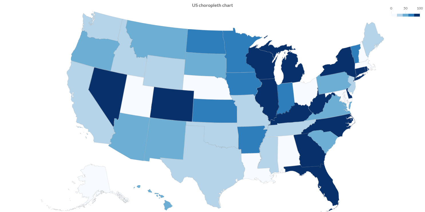
A choropleth chart is a type of thematic map in which a set of pre-defined areas is colored or patterned in proportion to a statistical variable that represents an aggregate summary of a geographic characteristic within each area, such as population density or per-capita income.
Choropleth maps provide an easy way to visualize how a variable varies across a geographic area or show the level of variability within a region. The choropleth is likely the most common type of thematic map because published statistical data (from government or other sources) is generally aggregated into well-known geographic units, such as countries, states, provinces, and counties.
Programmatically, you could use a bar chart as following:
// creates the chart
ChoroplethChart chart = new ChoroplethChart();
// adds to DOM
component.add(chart);
...
// example for Elemental2
// gets the chart instance as DOM element
Element element = chart.getChartElement().as();
// adds to DOM
DomGlobal.document.body.appendChild(element);
By UIBinder (ONLY for GWT), you could use a bar chart as following:
<ui:UiBinder xmlns:ui="urn:ui:com.google.gwt.uibinder"
   xmlns:g="urn:import:com.google.gwt.user.client.ui"
   xmlns:c="urn:import:org.pepstock.charba.client.gwt.widgets">

   <g:HTMLPanel  width="100%">
      ....
      <c:ChoroplethChartWidget ui:field="chart"/>
      ...
   </g:HTMLPanel>
</ui:UiBinder>
Dataset
The choropleth chart allows to define the data and a number of properties, used to display the data, by a choropleth dataset.
Every chart has got a method to create a typed dataset accordingly with the chart type. The dataset can be also created instantiating the constructor.
// creates the chart
ChoroplethChart chart = new ChoroplethChart();
// creates the dataset
ChoroplethDataset dataset = chart.newDataset();
// sets the option
dataset.setShowGraticule(true);
...
// creates the dataset
ChoroplethDataset datasetNew = new ChoroplethDataset();
// sets the option
datasetNew.setShowGraticule(true);
...
// sets the dataset to the chart
chart.getData().setDatasets(dataset);
The following are the attributes that you can set:
| Name | Type | Default | Description |
|---|---|---|---|
| clipMap | boolean - ClipMap | ClipMap.TRUE | Whether to clip the rendering to the chart area of the graph or to another area. |
| outline | Feature[] | [] | The features used to scale and centralize the projection in the chart area. |
| showGraticule | boolean - Graticule | false | If enabled it by true or graticule object instance, it renders the lines in the background. |
| showOutline | boolean | false | If true to render the outline in the background |
Styling
The style of the dataset can be configured by choropleth bar, which extends a Bar elements, as following:
| Name | Type | Default | Description |
|---|---|---|---|
| graticuleBorderColor | String - IsColor | rgb(204,204,204) - | The graticule border color. |
| graticuleBorderWidth | int | 0 | The outline border width. |
| outlineBackgroundColor | String - IsColor | null | The outline background color. |
| outlineBorderColor | String - IsColor | Defaults.get().getGlobal().getBorderColorAsString() | The outline border color. |
| outlineBorderWidth | int | 0 | The outline border width. |
// from chart instance
ChoroplethBar choroplethElement = chart.getOptions().getElements().getChoroplethBar();
// sets options for choropleth datasets of the chart
choroplethElement.setOutlineBorderWidth(3);
choroplethElement.setGraticuleBorderColor(HtmlColor.RED);
...
Data structure
Choropleth dataset needs to contain a data array of points, each data point has to contain the Feature to render and containing the value for the coloring.
Choropleth data points are mapped by ChoroplethDataPoint.
// gets the topoJSON map as string
String topoJsonText = MyResources.INSTANCE.topojsonEarth().getText();
// creates a topoJSON object, needed for further computations
TopoJson world = GeoUtils.createTopoJson(topoJsonText);
// the node name in "objects" one where the topology
// are stored is "countries"
List<Feature> features = GeoUtils.features(world, "countries");
...
// creates data points container
List<ChoroplethDataPoint> dataPoints = new LinkedList<>();
for (Feature feature : features){
  // creates a data point
  ChoroplethDataPoint dp = new ChoroplethDataPoint(feature, 20);
  // adds data points
  dataPoints.add(dp);
}
// sets values by an list of data points
dataset.setValues(dataPoints);
The setData and setDataPoints methods are available, inherited by the bar dataset, but you can NOT use them otherwise an exception will throw.
Use setValues instead.
Options
The choropleth chart defines specific options implementation to be configured.
// creates the chart
ChoroplethChart chart = new ChoroplethChart();
// gets the chart options
ChoroplethOptions options = chart.getOptions();
// sets option
options.setResponsive(true);
These are the options specific to choropleth charts:
| Name | Type | Default | Description |
|---|---|---|---|
| clipMap | boolean - ClipMap | ClipMap.TRUE | Whether to clip the rendering to the chart area of the graph or to another area. |
| outline | Feature[] | empty list | The features used to scale and centralize the projection in the chart area. |
| showGraticule | boolean - Graticule | false | If enabled it by true or graticule object instance, it renders the lines in the background. |
| showOutline | boolean | false | If true to render the outline in the background |
The choropleth chart disables the legend component and the options can NOT be set globally but only at chart level.
Scales
A choropleth chart can have maximum 2 scales, of the following types:
- Projection scale which defines a way to flatten a globe's surface into a plane in order to make a map.
- Color scale which enables the coloring of the nodes.
Projection axis
A Projection axis is managing the map projection.
A map projection is a way to flatten a globe's surface into a plane in order to make a map.
This requires a systematic transformation of the latitudes and longitudes of locations from the surface of the globe into locations on a plane.
Here is an example how to create a projection axis:
// creates the chart
ChoroplethChart chart = new ChoroplethChart();
// creates a projection axis
// scale id and axis kind are already defined
ProjectionAxis axis = new ProjectionAxis(chart);
// adds axes to chart configuration
chart.getOptions().setAxes(axis);
Options
The projection axis allows to define a number of properties, used to display the data.
// creates a projection axis
ProjectionAxis axis = new ProjectionAxis(chart);
// sets options
axis.setProjection(Projection.EQUAL_EARTH);
axis.setProjectionScale(0.5);
axis.setProjectionOffset(0, -50);

Projection projection = axis.getProjection();
The following are the attributes that you can set:
| Name | Type | Default | Description |
|---|---|---|---|
| padding | Padding | 0 to all dimensions | Sets padding applied during auto scaling of the map in pixels, i.e. the chart size is reduce by the padding before fitting the map. |
| projection | Projection | Projection.ALBERS_USA | The map projection which is a way to flatten a globe's surface into a plane in order to make a map |
| projectionOffset | [double, double] | [] | The map projection offset value. |
| projectionScale | double | Undefined.DOUBLE | How much the map will be scaled. |
Color axis
A color axis is managing the coloring of the nodes.
A color axis manages how the map must be colored providing also a legend to see the color distribution for the choropleth chart.
There are 2 axis types for coloring the nodes:
- Color axis which extends the cartesian linear axis to repesent numbers.
- Color logarithmic axis which extends the cartesian logarithmic axis to represent number by logarithmic base.
Here is an example how to create a color axis:
// creates the chart
ChoroplethChart chart = new ChoroplethChart();
// creates a color axis
// scale id and axis kind are already defined
ColorAxis axis = new ColorAxis(chart);
// adds axes to chart configuration
chart.getOptions().setAxes(axis);
Options
The color axis allows to define a number of properties, used to display the data.
// creates a color axis
ColorAxis axis = new ColorAxis(chart);
// sets options
axis.setInterpolate(Interpolate.BLUES);
axis.setQuantize(5);

Interpolate interpolate = axis.getInterpolate();
The following are the attributes that you can set:
| Name | Type | Default | Scriptable | Description |
|---|---|---|---|---|
| interpolate | Interpolate | Interpolate.BLUES | Yes | The color interpolation of the scale. |
| missingColor | String - IsColor | HtmlColor.TRANSPARENT | Yes | The color to use the data is missing. |
| quantize | int | 0 | Yes | The amount of pieces to allow to split the color scale in N quantized equal bin. |
Interpolate callback
You can set the color interpolation of the scale at runtime, providing different colors for different features.
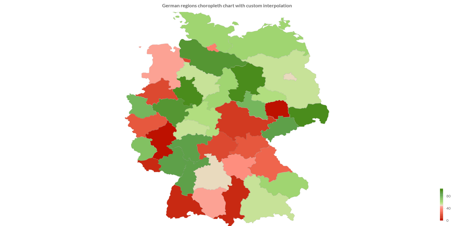
The interpolate property can be set as scriptable option, as following:
// uses the color list of tableau color scheme
private static final List<IsColor> COLORS = TableauScheme.CLASSIC_AREA_RED_GREEN21.getColors();
...
...
// creates a color axis
ColorAxis axis = new ColorAxis(chart);
// sets callback
axis.setInterpolate(new InterpolateCallback(){

    /**
     * Returns a color instance.
     *
     * @param normalizedValue normalized value of the data set
     * @return a color instance
     */
    @Override
    public Object interpolate(double normalizedValue) {
       int index = (int)Math.round(normalizedValue * (COLORS.size() - 1));
       return COLORS.get(Math.min(index, COLORS.size() - 1));
    }
});
Legend
You can configure the legend which is representing the color interpolation for choropleth chart.
// creates a color axis
ColorAxis axis = new ColorAxis(chart);
// sets legend options
axis.getLegend().setPosition(Position.TOP_RIGHT);

Position position = axis.getLegend().getPosition();
The following are the attributes that you can set:
| Name | Type | Default | Scriptable | Description |
|---|---|---|---|---|
| align | Align | Align.RIGHT | Yes | The alignment of the legend on the chart area. |
| indicatorWidth | int | 10 | Yes | how many pixels should be used for the color bar. |
| length | int | 100 | Yes | The length of the legend, in terms of value. |
| margin | int | 8 | Yes | The margin pixels such that it doesn't stick to the edge of the chart. |
| position | Position - PositionPoint | Position.BOTTOM_RIGHT | Yes | The location of the legend on the chart area. |
| width | int | 50 | Yes | How wide the scale is. For a horizontal scale the height if a value less than 1 is given, is it assume to be a ratio of the corresponding chart area. |
Scriptable
Scriptable options at scale level accept a callback which is called for each of the underlying scale values. See more details in Configuring charts section.
// creates a color axis
ColorAxis axis = new ColorAxis(chart);
// sets legend options by a callback
axis.getLegend().setPosition(new PositionCallback(){

   @Override
   public Position invoke(ScaleContext context){
      // logic
      return position;
   }
});
The following options can be set by a callback:
| Name | Callback | Returned types |
|---|---|---|
| missingColor | ColorCallback<ScaleContext> | String - IsColor |
| quantize | QuantizeCallback | int |
| align | AlignCallback | Align |
| indicatorWidth | WidthCallback<ScaleContext> | int |
| length | LengthCallback | int |
| margin | MarginCallback | int - Margin |
| position | PositionCallback | Position - PositionPoint |
| width | WidthCallback<ScaleContext> | int |