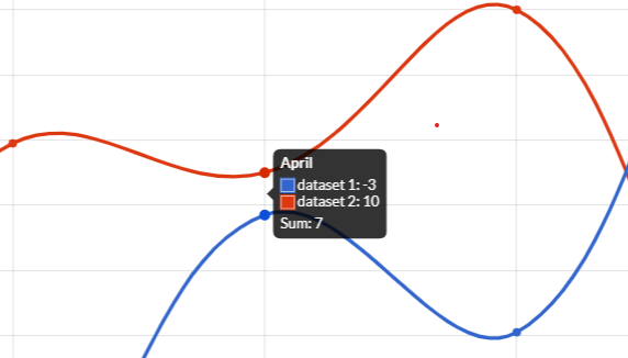
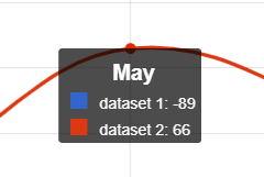
Tooltip
A tooltip is a text description near an object. The tooltip is displayed when the user hovers the mouse cursor over the object.
Tooltips are helpful for new users because they enable the user to learn about each icon or object by hovering their mouse over them.
To get, change and apply own properties, you can invoke the set and get methods, as following:
// enables tooltip, setting the interaction mode
chart.getOptions().getTooltips().setEnabled(true);
chart.getOptions().getTooltips().setMode(DefaultInteractionMode.AVERAGE);

boolean enabled = chart.getOptions().getTooltips().isEnabled();
IsInteractionMode mode = chart.getOptions().getTooltips().getMode();
The default values are set in global defaults options, see default global tooltip options.
The following are the attributes that you can set:
| Name | Type | Description |
|---|---|---|
| backgroundColor | String - IsColor | Background color of the tooltips. |
| bodyColor | String - IsColor | Color of body text. |
| bodyFont | IsFont | Font of body text. The default value is the global font with the style set to FontStyle.NORMAL. See Font. |
| bodyAlign | TextAlign | Alignment of body element of the tooltips. |
| bodySpacing | int | Spacing to add to top and bottom of each tooltip item. |
| borderColor | String - IsColor | Color of the border. |
| borderWidth | int | Size of the border. |
| boxWidth | int | Width of the color box if displayColors is true. |
| boxHeight | int | Height of the color box if displayColors is true. |
| caretPadding | int | Extra distance to move the end of the tooltip arrow away from the tooltip point. |
| caretSize | int | Size, in px, of the tooltip arrow. |
| cornerRadius | int - BarBorderRadius | Radius of tooltip corner curves. |
| displayColors | boolean | If true, color boxes are shown in the tooltip. |
| enabled | boolean | If true, the tooltips are enabled. |
| events | IsEvent[] - Set<IsEvent> | The events option defines the browser events that the tooltip should listen to. |
| footerColor | String - IsColor | Color of the footer. |
| footerFont | IsFont | Font of footer text. The default value is the global font with the style set to FontStyle.BOLD. See Font. |
| footerAlign | TextAlign | Alignment of footer element of the tooltips. |
| footerMarginTop | int | Margin to add before drawing the footer. |
| footerSpacing | int | Spacing to add to top and bottom of each footer line. |
| intersect | boolean | if true, the tooltip mode applies only when the mouse position intersects with an element. If false, the mode will be applied at all times. |
| mode | String - IsInteractionMode | Sets which elements appear in the tooltip. |
| multiKeyBackground | String - IsColor | Color to draw behind the colored boxes when multiple items are in the tooltip. |
| padding | Padding | The padding to add inside the tooltip. See padding documentation for more details. |
| position | TooltipPosition | The mode for positioning the tooltip. |
| rtl | boolean | true for rendering the tooltips from right to left. |
| textDirection | TextDirection | This will force the text direction on the canvas for rendering the tooltips, regardless of the CSS specified on the canvas |
| titleColor | String - IsColor | Color of the footer. |
| titleFont | IsFont | Font of title text. The default value is the global font with the style set to FontStyle.BOLD. See Font. |
| titleAlign | TextAlign | Alignment of title element of the tooltips. |
| titleMarginBottom | int | Margin to add on bottom of title section. |
| titleSpacing | int | Spacing to add to top and bottom of each title line. |
| usePointStyle | boolean | Use the corresponding point style (from dataset options) instead of color boxes (size is based on the minimum value between box width and box height). |
| xAlign | TooltipAlign | Position of the tooltip caret in the X direction. Can accept only TooltipAlign.LEFT, TooltipAlign.CENTER and TooltipAlign.RIGHT. |
| yAlign | TooltipAlign | Position of the tooltip caret in the Y direction. Can accept only TooltipAlign.TOP, TooltipAlign.CENTER and TooltipAlign.BOTTOM. |
Positioning
Possible tooltip position out-of the box are:
TooltipPosition.AVERAGE, it will place the tooltip at the average position of the items displayed in the tooltip.TooltipPosition.NEAREST, it will place the tooltip at the position of the element closest to the event position.
New modes can be defined by adding a custom implementation, by a TooltipPositioner which can provide the tooltip position based on own logic.
By the Positioner singleton, you could register and unregister custom positioners.
// creates my tooltip position
final CustomTooltipPosition myPosition = new CustomTooltipPosition("myPosition");
// registers new tooltip positioner
Positioner.get().register(new TooltipPositioner(){

   /**
    * Returns the tooltip position
    * which must be used in chart options.
    *
    * @return the tooltip position.
    */
   @Override
   public CustomTooltipPosition getName(){
       return myPosition;
   }

   /**
    * Applies own logic to returns the point where the tooltip must be showed.
    *
    * @param chart chart instance
    * @param items list of dataset reference items
    * @param eventPoint the point of event when the method has been invoked
    * @return the point where the tooltip must be showed.
    */
   @Override
   public Point computePosition(IsChart chart, List<DatasetReference> items, Point eventPoint){
       ChartAreaNode area = chart.getNode().getChartArea();
       Point p = new Point();
       p.setX(area.getLeft());
       p.setY(area.getTop());
       return p;
   });
}
....
// sets new tooltip position to chart options
chart.getOptions().getTooltips().setPosition(myPosition);
If the positioner will return null instead of a point, the tooltip will disappear.
The Positioner provides a method to get the position calculated by defined tooltip position.
// creates my tooltip position
final CustomTooltipPosition myPosition = new CustomTooltipPosition("myPosition");
// registers new tooltip positioner
Positioner.get().register(new TooltipPositioner(){

   /**
    * Returns the tooltip position
    * which must be used in chart options.
    *
    * @return the tooltip position.
    */
   @Override
   public CustomTooltipPosition getName(){
       return myPosition;
   }

   /**
    * Applies own logic to returns the point where the tooltip must be showed.
    *
    * @param chart chart instance
    * @param items list of dataset reference items
    * @param eventPoint the point of event when the method has been invoked
    * @return the point where the tooltip must be showed.
    */
   @Override
   public Point computePosition(IsChart chart, List<DatasetReference> items, Point eventPoint){
       ChartAreaNode area = chart.getNode().getChartArea();
       Point p = new Point();
       p.setX(area.getLeft());
        Point average = Positioner.get().invokePositioner(TooltipPosition.AVERAGE, chart, items, eventPoint);
        if (average != null) {
            p.setY(average.getY());
            return p;
        }
        // hide tooltip
        return null;
   });
}
....
// sets new tooltip position to chart options
chart.getOptions().getTooltips().setPosition(myPosition);
If you unregister a positioner and a chart still is configured with the custom tooltip position, Charba will throw an exception when the chart will be updated.
Items callbacks
A chart tooltips can be configured at runtime, providing some interfaces for a specific purpose.
Sorting
The implementation of TooltipItemSortCallback allows sorting of tooltip items.
To apply the callback, you can set a instance to the chart options, as following:
chart.getOptions().getTooltips().setItemSortCallback(new TooltipItemSortCallback(){

   /**
    * Allows sorting of tooltip items.
    *
    * @param chart chart instance
    * @param item1 the first object to be compared.
    * @param item2 the second object to be compared.
    * @return a negative integer, zero, or a positive integer as the first argument
    *         is less than, equal to, or greater than the second.
    */
   @Override
   public int onItemSort(IsChart chart, TooltipItem item1, TooltipItem item2){
      // logic
      return 0;
   }

});
The callback uses a couple of TooltipItem to enable the sort.
Filtering
The implementation of TooltipFilterCallback allows filtering of tooltip items.
To apply the callback, you can set a instance to the chart options, as following:
chart.getOptions().getTooltips().setFilterCallback(new TooltipFilterCallback(){

   /**
    * Allows filtering of tooltip items.
    *
    * @param chart chart instance
    * @param item item to be filtered
    * @return false to remove the item
    *         from the container, otherwise true.
    */
   @Override
   public boolean onFilter(IsChart chart, TooltipItem item){
      // logic
      return true;
   }

});
The callback uses TooltipItem to enable filtering.
Elements callbacks
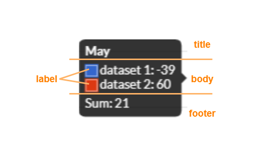
There are a set of available callbacks to configure and customize own tooltips. The tooltip callbacks configuration is nested in the tooltip configuration.
To simplify the implementation of all callbacks available in Chart.JS, Charba splits the callbacks in 4 main ones, to manage every single element of a tooltip separately:
- Title
- Body
- Footer
- Labels
All callbacks must be set in a inner element of tooltip configuration, as following:
// gets the inner callbacks element
TooltipsCallbacks callbacks = chart.getOptions().getTooltips().getCallbacks();
To invoke the default behavior of the chart, you can use defaults methods of Defaults object.
Title
The TooltipTitleCallback is triggered for providing text of title.
All methods must return a list of strings which are treated as multiple lines of text.
This callback takes care about labels to apply to the title, all methods are implemented by own defaults in order that you can implement only the method where you are interested in:
public interface TooltipTitleCallback {

   /**
    * Returns the text to render before the title.
    * If returns null or empty list, it will be ignored.
    *
    * @param chart chart instance
    * @param items list of all tooltip items
    * @return a list of labels to apply to the title.
    */
   default List<String> onBeforeTitle(IsChart chart, List<TooltipItem> items){
      return Collections.emptyList();
   }

   /**
    * Returns text to render as the title of the tooltip.
    * If returns null or empty list, it will be ignored.
    *
    * @param chart chart instance
    * @param items list of all tooltip items
    * @return a list of labels to apply to the title.
    */
   default List<String> onTitle(IsChart chart, List<TooltipItem> items){
      return Defaults.get().invokeTooltipsCallbackOnTitle(chart, items);
   }

   /**
    * Returns text to render after the title.
    * If returns null or empty list, it will be ignored.
    *
    * @param chart chart instance
    * @param items list of all tooltip items
    * @return a list of labels to apply to the title.
    */
   default List<String> onAfterTitle(IsChart chart, List<TooltipItem> items){
      return Collections.emptyList();
   }

}
To apply the callback, you can set a TooltipTitleCallback instance to the chart options, as following:
chart.getOptions().getTooltips().getCallbacks().setTitleCallback(new TooltipTitleCallback){

// implementation

});
Body
The TooltipBodyCallback is triggered for providing text of body.
All methods must return a list of strings which are treated as multiple lines of text.
This callback takes care about labels to apply to the body, all methods are implemented by own defaults in order that you can implement only the method where you are interested in:
public interface TooltipBodyCallback {

   /**
    * Returns text to render before the body section.
    * If returns null or empty list, it will be ignored.
    *
    * @param chart chart instance
    * @param items list of all tooltip items
    * @return a list of labels to apply to the body.
    */
   default List<String> onBeforeBody(IsChart chart, List<TooltipItem> items){
      return Collections.emptyList();
   }

   /**
    * Returns text to render after the body section.
    * If returns null or empty list, it will be ignored.
    *
    * @param chart chart instance
    * @param items list of all tooltips items
    * @return a list of labels to apply to the body.
    */
   default List<String> onAfterBody(IsChart chart, List<TooltipItem> items){
      return Collections.emptyList();
   }
}
To apply the callback, you can set a TooltipBodyCallback instance to the chart options, as following:
chart.getOptions().getTooltips().getCallbacks().setBodyCallback(new TooltipBodyCallback){

// implementation

});
Footer
The TooltipFooterCallback is triggered for providing text of footer.
All methods must return a list of strings which are treated as multiple lines of text.
This callback takes care about labels to apply to the footer, all methods are implemented by own defaults in order that you can implement only the method where you are interested in:
public interface TooltipFooterCallback {

   /**
    * Returns text to render before the footer section.
    * If returns null or empty list, it will be ignored.
    *
    * @param chart chart instance
    * @param items list of all tooltip items
    * @return a list of labels to apply to the title.
    */
   default List<String> onBeforeFooter(IsChart chart, List<TooltipItem> items){
      return Collections.emptyList();
   }

   /**
    * Returns text to render as the footer of the tooltip.
    * If returns null or empty list, it will be ignored.
    *
    * @param chart chart instance
    * @param items list of all tooltip items
    * @return a list of labels to apply to the title.
    */
   default List<String> onFooter(IsChart chart, List<TooltipItem> items){
      return Collections.emptyList();
   }

   /**
    * Text to render after the footer section.
    * If returns null or empty list, it will be ignored.
    *
    * @param chart chart instance
    * @param items list of all tooltip items
    * @return a list of labels to apply to the title.
    */
   default List<String> onAfterFooter(IsChart chart, List<TooltipItem> items){
      return Collections.emptyList();
   }
}
To apply the callback, you can set a TooltipFooterCallback instance to the chart options, as following:
chart.getOptions().getTooltips().getCallbacks().setFooterCallback(new TooltipFooterCallback){

// implementation

});
Label
The TooltipLabelCallback is triggered for providing the text and colors that displays for a given data point.
This callback takes care about labels and styles to apply to the tooltip items, all methods are implemented by own defaults in order that you can implement only the method where you are interested in:
public interface TooltipLabelCallback {

   /**
    * Returns text to render before an individual label.
    * This will be called for each item in the tooltip.
    * If returns null or an empty list, it will be ignored.
    *
    * @param chart chart instance
    * @param item tooltip item
    * @return labels to be applied.
    */
   default List<String> onBeforeLabel(IsChart chart, TooltipItem item){
      return Collections.emptyList();
   }

   /**
    * Returns text to render for an individual item in the tooltip.
    * If returns null or an empty list, it will be ignored.
    *
    * @param chart chart instance
    * @param item tooltip item
    * @return labels to be applied.
    */
   default List<String> onLabel(IsChart chart, TooltipItem item){
      return Defaults.get().invokeTooltipsCallbackOnLabel(chart, item);
   }

   /**
    * Returns the colors and borders to render for the tooltip item.
    * If returns null, it will be ignored.
    *
    * @param chart chart instance
    * @param item tooltip item
    * @return label color to be applied.
    */
   default TooltipLabelColor onLabelColor(IsChart chart, TooltipItem item){
      return Defaults.get().invokeTooltipsCallbackOnLabelColor(chart, item);
   }

   /**
    * Returns the point style to use instead of color boxes if usePointStyle is true.
    * Default implementation uses the point style from the dataset points.
    *
    * @param chart chart instance
    * @param item tooltip item
    * @return point style to be applied.
    */
   default TooltipLabelPointStyle onLabelPointStyle(IsChart chart, TooltipItem item){
      return Defaults.get().invokeTooltipsCallbackOnLabelPointStyle(chart, item);
   }

   /**
    * Returns the colors for the text of the label for the tooltip item.
    * If returns null, it will be ignored.
    *
    * @param chart chart instance
    * @param item tooltip item
    * @return label text color to be applied.
    */
   default IsColor onLabelTextColor(IsChart chart, TooltipItem item){
      return chart.getOptions().getTooltips().getBodyColor();
   }

   /**
    * Returns text to render after an individual label.
    * If returns null or an empty list, it will be ignored.
    *
    * @param chart chart instance
    * @param item tooltip item
    * @return labels to be applied.
    */
   default List<String> onAfterLabel(IsChart chart, TooltipItem item){
      return Collections.emptyList();
   }
}
To apply the callback, you can set a TooltipLabelCallback instance to the chart options, as following:
chart.getOptions().getTooltips().getCallbacks().setLabelCallback(new TooltipLabelCallback){

// implementation

});
To set the color or borders of labels, there is TooltipLabelColor class which enable the setting of colors and borders.
To set the point style of labels, there is TooltipLabelPointStyle class which enable the setting of point style and the rotation to apply.
External rendering callback
The implementation of TooltipExternalCallback allows you to hook in the tooltip rendering process so that you can render the tooltip in own custom way.
 |
Generally this is used to create an HTML tooltip and you can enable custom tooltips in the chart configuration as following:
chart.getOptions().getTooltips().setExternalCallback(new TooltipExternalCallback(){

   /**
    * External tooltips callback allows you to hook in the tooltip
    * rendering process so that you can render the tooltip in your own
    * custom way.
    *
    * @param chart chart instance
    * @param model all info about tooltip to create own HTML tooltip.
    */
   @Override
   public onCustom(IsChart chart, TooltipModel model){
      // logic
   }

});
The callback can use the tooltip model, with the complete model about the tooltip.