Toast
(quoted from Pop-up notification definition in Wikipedia)
The terms pop-up notification, toast, passive pop-up, snackbar, desktop notification, notification bubble, or simply notification all refer to a graphical control element that communicates certain events to the user without forcing them to react to this notification immediately, unlike conventional pop-up windows.
Desktop notifications usually disappear automatically after a short amount of time. Often their content is then stored in some widget that allows the users to access past notifications at a more convenient time.

Charba provides out of the box the feature to enable toast.
The toasting is native javascript implementation and Charba provides the wrapper in order to be able to use it.
The toast utility can be used even if the Charba.enable or DeferredCharba.enable are not called because it doesn't depend on CHART.JS.
You could show a toast simply using one of the following sample:
options.getTitle().setContent();
// shows a toast with default type and without title
Toaster.get().show("This is my toast content");
...
// shows a toast, multiple lines, with default type and without title
Toaster.get().show(Arrays.asList("This is my toast content (row 1)", "This is my toast content (row2)"));
...
// shows a toast with default type ERROR (red) and without title
Toaster.get().show(DefaultToastType.ERROR, "This is my toast content");
...
// shows a toast, multiple lines, with default type INFO (blue) and without title
Toaster.get().show(DefaultToastType.INFO,
              Arrays.asList("This is my toast content (row 1)", "This is my toast content (row2)"));
...
// creates a toast options
ToastOptions options = new ToastOptions();
// sets type
options.setType(DefaultToastType.ERROR);
// shows a toast with user options and without title
Toaster.get().show(options, "This is my toast content");
...
// creates a toast options
ToastOptions options = new ToastOptions();
// sets type
options.setType(DefaultToastType.INFO);
// shows a toast, multiple lines, with user options and without title
Toaster.get().show(options,
              Arrays.asList("This is my toast content (row 1)", "This is my toast content (row2)"));
...
// shows a toast with default type and title
Toaster.get().show("This is my toast title", "This is my toast content");
...
// shows a toast, multiple lines, with default type and title
Toaster.get().show("This is my toast title",
              Arrays.asList("This is my toast content (row 1)", "This is my toast content (row2)"));
...
// shows a toast with default type ERROR (red) and title
Toaster.get().show(DefaultToastType.ERROR, "This is my toast title", "This is my toast content");
...
// shows a toast, multiple lines, with default type ERROR (red) and title
Toaster.get().show(DefaultToastType.ERROR, "This is my toast title",
              Arrays.asList("This is my toast content (row 1)", "This is my toast content (row2)"));
...
// creates a toast options
ToastOptions options = new ToastOptions();
// sets type
options.setType(DefaultToastType.ERROR);
// shows a toast with user options and title
Toaster.get().show(options, "This is my toast title", "This is my toast content");
...
Toaster.get().show(ToastOptions options, String title, List<String> label);
// creates a toast options
ToastOptions options = new ToastOptions();
// sets type
options.setType(DefaultToastType.INFO);
// shows a toast with user options and title
Toaster.get().show(options, "This is my toast title",
              Arrays.asList("This is my toast content (row 1)", "This is my toast content (row2)"));
Both title and label can contain HTML code.
The show method is returning a status instance which report if the toast is showing, on queue, invalid or discard.
// shows a toast with default type and without title
Status status = Toaster.get().show("This is my toast content");
// checks status
if (Status.INVALID.equals(status) || Status.DISCARDED.equals(status)) {
  // the toast is not shown and will not
}
Context
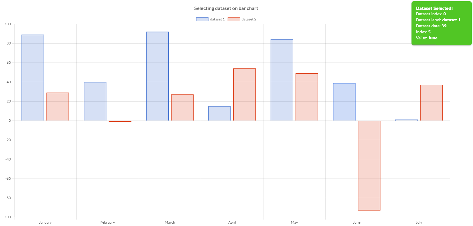
When you show the context, you can pass a context, which is a map of objects, where you can store your objects in order to be them available in the handlers or actions.
The map is a key-value object.
// adds a dataset selection handler to a chart
chart.addHandler(new DatasetSelectionEventHandler() {

    @Override
    public void onSelect(DatasetSelectionEvent event) {
        // creates toast context
        Map<String, Object> context = new HashMap<>();
        // stores the object in the context
        context.put("event", event);
        // creates toast options
        ToastOptions options = new ToastOptions();
        // adds close handler instance
        options.setCloseHandler(new CloseHandler() {

            @Override
            public void onClose(ToastItem item, ActionItem action) {
                DatasetSelectionEvent event = (DatasetSelectionEvent)item.getContext().get("event");
                // my logic
            }
        });
        // shows the toast
        Toaster.get().show(context, options, "This is my toast title", "This is my toast content");
    }
}, DatasetSelectionEvent.TYPE);
Options
The toast utility allows to define the properties that a toast could have to render the toast, by a toast options.
// creates a toast options
ToastOptions options = new ToastOptions();
// sets type
options.setType(DefaultToastType.INFO);
// sets progress bar type
options.setProgressBarType(DefaultProgressBarType.ERROR);
// sets icon
options.setIcon(ImagesHelper.toImg(Images.INSTANCE.fingerprintWhite()));
// shows toast
Status status = Toaster.get().show(options, "This is my toast title", "This is my toast content");
This is the structure and main components of a toast:
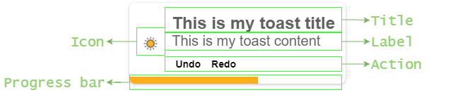
The following are the attributes that you can set:
| Name | Type | Default | Description |
|---|---|---|---|
| actions | ActionItem[] | [] | Set the custom action to show in the toast. See actions section for details. |
| align | Align | Align.LEFT | Set the alignment of the toast actions. |
| autoHide | boolean | true | Set to false to avoid that the toast will disappear automatically. To close it, you must click on the toast. |
| borderRadius | int | 8 | The border radius of the toast element. |
| hideProgressBar | boolean | false | Set to true to hide the progress bar on the toast element. |
| hideShadow | boolean | false | Set to true to hide the shadow on the toast element. |
| icon | Img | null | To add an icon on the toast. |
| modifierKey | ModifierKey | null | Keyboard modifier key which must be pressed to enable the closure of the toast clicking on it. |
| progressBarHeight | int | 3 | The height of progress bar in pixels. |
| progressBarType | IsProgressBarType | DefaultProgressBarType.DEFAULT | The type of the progress bar to show on the toast element. |
| timeout | int | 4000 | The duration of toast, after that the toast will be hide automatically, according with autoHide option. |
| type | IsToastType | DefaultToastType.DEFAULT | The type of the toast. |
Defaults
You can set default options to use for all toasts you want to show in your application, without replicating the same configuration on several part of the application, by the default toast options, accessible by the toaster.
// gets the default toast options
DefaultToastOptions options = Toaster.get().getDefaults();
// sets type
options.setType(DefaultToastType.INFO);
// sets progress bar type
options.setProgressBarType(DefaultProgressBarType.ERROR);
// sets icon
options.setIcon(ImagesHelper.toImg(Images.INSTANCE.fingerprintWhite()));
Content
Based on the toast structure, you can set 3 different kinds of options to render the toast elements:
- Title, which is a text, highlighted on the top of the toast
- Label, which is a text, on the bottom of the toast
- Action, which is a list of clickable elements, below the label.
Title
The toast title is a text which is located on the top of toast in order to provide a synthetic information about the toast.
// creates a toast options
ToastOptions options = new ToastOptions();
// gets title
Title title = options.getTitle();
// sets color (overriding the toast type)
title.setColor(HtmlColor.BLACK);
// sets font
title.getFont().setSize(16);
The following are the attributes that you can set:
| Name | Type | Default | Description |
|---|---|---|---|
| color | String - IsColor | #616161 - | Set the font color of title content. Setting it, you override the color that a toast type has been configured to use. |
| font | IsFont | see description | Font of text of title. The default font of the title has got the weight set to Weight.BOLD and the size to 15.See Font. |
Label
The toast label is a text which is located on the bottom of toast in order to provide the message to the user.
// creates a toast options
ToastOptions options = new ToastOptions();
// gets label
Label label = options.getLabel();
// sets color (overriding the toast type)
label.setColor(HtmlColor.RED);
// sets font
label.getFont().setSize(12);
The following are the attributes that you can set:
| Name | Type | Default | Description |
|---|---|---|---|
| color | String - IsColor | #616161 - | Set the font color of label content. Setting it, you override the color that a toast type has been configured to use. |
| font | IsFont | see description | Font of text of label. The default font of the title has got the lineHeight set to 20px and the size to 14.See Font. |
Action
The toast action is a list of clickable elements which is located on the bottom of toast, below the label, in order to allow the user to perform specific actions from the toast.
// creates a toast options
ToastOptions options = new ToastOptions();
// gets action
Action action = options.getAction();
// sets background color for all actions
action.setBackgroundColor(HtmlColor.RED);
// sets font
action.getFont().setSize(12);
The following are the attributes that you can set in order to apply the configured options to all actions:
| Name | Type | Default | Description |
|---|---|---|---|
| backgroundColor | String - IsColor | HtmlColor.TRANSPARENT | Set the background color of the configured actions elements. |
| borderColor | String - IsColor | HtmlColor.TRANSPARENT | Set the border color of the configured actions elements. |
| borderRadius | int | 0 | Set the border radius of the configured actions elements. |
| borderStyle | BorderStyle | BorderStyle.NONE | Set the border style of the configured actions elements. |
| borderWidth | int | 0 | Set the border width of the configured actions elements. |
| color | String - IsColor | #616161 - | Set the font color of toast action element. |
| font | IsFont | see description | Font of text of toast action element. The default font of the actions have got the lineHeight set to 20px and the size to 14.See Font. |
See actions section how you can set your toast actions and override the above options.
Type
Every toast has got own type, which will provide the information how to color the toast, both background and font color.
// DIRECTLY
// shows toast
Status status = Toaster.get().show(DefaultToastType.INFO, "This is my toast title", "This is my toast content");
...
// by OPTIONS
// creates a toast options
ToastOptions options = new ToastOptions();
// sets type
options.setType(DefaultToastType.INFO);
// sets other options
...
// shows toast
Status status = Toaster.get().show(options, "This is my toast title", "This is my toast content");
There are some types provided out of the box, by the default type enumeration.
The following table shows the different colors for each default type.
| Type | Background | Color | Example |
|---|---|---|---|
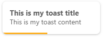
| DEFAULT | HtmlColor.WHITE - | #616161 - |  |
| SUCCESS | #51C625 - | HtmlColor.WHITE - |  |
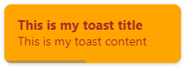
| WARNING | #DB9215 - | HtmlColor.WHITE - | 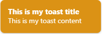 |
| ERROR | #DB2B1D - | HtmlColor.WHITE - | 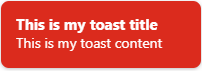 |
| INFO | #27ABDB - | HtmlColor.WHITE - | 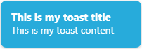 |
| DARK | HtmlColor.BLACK - | HtmlColor.WHITE - |  |
Custom type
Where the default types are not enough and you want to use own colors for your toast, you can create your own type, by a toast type builder.
Here is the code to created it.
// creates my type
// passing own name, font and background colors
IsToastType myType = ToastTypeBuilder.create("myType", HtmlColor.BROWN, HtmlColor.ORANGE).build();
// shows toast
Status status = Toaster.get().show(myType, "This is my toast title", "This is my toast content");
...
// by OPTIONS
// creates my type
// passing own name, font and background colors
IsToastType myType = ToastTypeBuilder.create("myType", HtmlColor.BROWN, HtmlColor.ORANGE).build();
// creates a toast options
ToastOptions options = new ToastOptions();
// sets type
options.setType(myType);
// sets other options
...
// shows toast
Status status = Toaster.get().show(options, "This is my toast title", "This is my toast content");
A custom type can be created using Pattern or Gradient as background.
The name of the type must follow the following rule, otherwise an exception will occur:
- must start with a letter,
[a-zA-Z]+ - must contains whatever letter, number, underscore, hyphen,
[_a-zA-Z0-9-]*
ProgressBar type
Every toast can have own progress bar in order to show to the user how much time is remaining before hiding the toast. A progress bar has got own type which will provide the information how to color the bar.
// creates a toast options
ToastOptions options = new ToastOptions();
// sets progress bar type
options.setProgressBarType(DefaultProgressBarType.ERROR);
...
// shows toast
Toaster.get().show(options, "This is my toast title", "This is my toast content");
There are some progress bar types provided out of the box, by the default type enumeration.
The following table shows the different colors for each default type.
| Type | Background |
|---|---|
| DEFAULT | HtmlColor.BLACK - |
| SUCCESS | #51C625 - |
| WARNING | #DB9215 - |
| ERROR | #DB2B1D - |
| INFO | #27ABDB - |
| RAINBOW | not color but a gradient: |
Custom progress bar type
Where the default progress bar types are not enough and you want to use own colors for your bar, you can create your own type, by a toast progress bar type builder.
Here is the code to created it.
// creates my type
// passing own name and background colors
IsProgressBarType myType = ProgressBarTypeBuilder.create("myType", HtmlColor.ORANGE).build();
// creates a toast options
ToastOptions options = new ToastOptions();
// sets my progress bar
options.setProgressBarType(myType);
...
// shows toast
Toaster.get().show(options, "This is my toast title", "This is my toast content");
A custom progress bar type can be created using Gradient as background.
The name of the type must follow the following rule, otherwise an exception will occur:
- must start with a letter,
[a-zA-Z]+ - must contains whatever letter, number, underscore, hyphen,
[_a-zA-Z0-9-]*
Actions
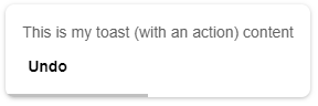
Actions make your toast interactive, letting the user take quick actions on your toast notification without interrupting their current workflow.
Actions appear in the expanded portion of your notification.
An action can be composed by the following items:
- id, is an optional item, to have a unique name of the instance. If not set, an automatic id is calculated.
- content, is an optional item, to set the content to show in the toast. If not set, the id is used as content.
- handler, is an mandatory item, to set the callback to use when the action is clicked.
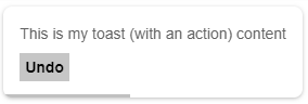
// creates my action with id and content
// when the action is clicked the toast is closed
ActionItem action = new ActionItem("Undo", "Undo", new ActionClickEventHandler() {

    /**
     * Invoked to manage CLICK events on toast action.
     *
     * @param item toast item affected by event
     * @param event event fired on item
     * @return true if the toaster must be close after click on action
     */
    @Override
    public boolean onClick(ToastItem item, NativeMouseEvent newEvent) {
        // logic
        return true;
    }
});
// sets bold to font
action.getFont().setWeight(Weight.BOLD);
// creates the options
ToastOptions options = new ToastOptions();
// sets actions
options.setActions(action);
// shows toast
Toaster.get().show(options, "This is my toast (with an action) content");
A action click handler must return a boolean in order to close the toast when action is clicked (returning true) or leave the toast to be close naturally at the end of timeout (returning false).
The id of the action must follow the following rule, otherwise an exception will occur:
- must start with a letter,
[a-zA-Z]+ - must contains whatever letter, number, underscore, hyphen,
[_a-zA-Z0-9-]*
Options
Every single action can be configured in order to have a specific rendering on the user interface, overriding the common options defined in the action configuration element.
// creates my action with id and content
// when the action is clicked the toast is closed
ActionItem action = new ActionItem("Undo", "Undo", new ActionClickEventHandler() {

    /**
     * Invoked to manage CLICK events on toast action.
     *
     * @param item toast item affected by event
     * @param event event fired on item
     * @return true if the toaster must be close after click on action
     */
    @Override
    public boolean onClick(ToastItem item, NativeMouseEvent newEvent) {
        // logic
        return true;
    }
});
// sets bold to font
action.getFont().setWeight(Weight.BOLD);
// sets background color
action.setBackgroundColor("#C6C6C6");
The following table shows the different colors for each default type.
| Name | Type | Default | Description |
|---|---|---|---|
| backgroundColor | String - IsColor | HtmlColor.TRANSPARENT | Set the background color of the configured action element. |
| borderColor | String - IsColor | HtmlColor.TRANSPARENT | Set the border color of the configured action element. |
| borderRadius | int | 0 | Set the border radius of the configured action element. |
| borderStyle | BorderStyle | BorderStyle.NONE | Set the border style of the configured action element. |
| borderWidth | int | 0 | Set the border width of the configured action element. |
| color | String - IsColor | #616161 - | Set the font color of toast action element. |
| font | IsFont | see description | Font of text of toast action element. The default font of the actions have got the lineHeight set to 20px and the size to 14.See Font. |
Handlers
The toast utility provides the capabilities to listen when some status or actions are changed on the toast instance.
The status or actions are:
- Open toast, when the toast is open, the handler is engaged
- Click event, when a click event is fired on the toast, the handler is engaged
- Close toast, when the toast is close, the handler is engaged
Open handler
The open handler is triggered when a toast is open and shown on the user interface.
// creates a toast options
ToastOptions options = new ToastOptions();
...
// sets open handler
options.setOpenHandler(new OpenHandler(){

    /**
     * Invoked to be notified of toast item opening.
     *
     * @param item toast item affected
     */
    public void onOpen(ToastItem item) {
       // my logic
    }
});
...
// shows toast
Toaster.get().show(options, "This is my toast title", "This is my toast content");
The handler provides a toast item which contains all options of the toast and additional information related to the runtime context where the toast is shown. See here the toast item details.
Close handler
The close handler is triggered when a toast is close and removed from the user interface.
// creates a toast options
ToastOptions options = new ToastOptions();
...
// sets close handler
options.setCloseHandler(new CloseHandler(){

    /**
     * Invoked to be notified of toast item closing.
     *
     * @param item toast item affected
     * @param action action which closed the toast or null if the toast has been closed naturally.
     */
    public onClose(ToastItem item, ActionItem action);
       // my logic
    }
});
...
// shows toast
Toaster.get().show(options, "This is my toast title", "This is my toast content");
The handler provides a toast item which contains all options of the toast and additional information related to the runtime context where the toast was shown and the action item, the toast has been closed clicking on a actioin.
See here the toast item details.
See here the action item details.
Click event handler
The click event handler is triggered when a click event is fired on the shown toast in the user interface.
// creates a toast options
ToastOptions options = new ToastOptions();
...
// sets click event handler
options.setClickEventHandler(new ClickEventHandler(){

    /**
     * Invoked to manage CLICK events on toast item.
     *
     * @param item toast item affected by event
     * @param event event fired on item
     */
    void onClick(ToastItem item, NativeMouseEvent event){
       // my logic
    }
});
...
// shows toast
Toaster.get().show(options, "This is my toast title", "This is my toast content");
The handler provides a toast item which contains all options of the toast and additional information related to the runtime context where the toast was shown and the event fired on the toast. See here the toast item details.
Maximum shown notifications
The toast utility provides the capability to limit the amount of toast you want to show in the user interface, at the same time.
This is because many toasts could waste the user interface making it chaotic.
You can decide how to manage new message to show when the maximum amount of open toasts is already reached, by the 2 policies, enumerated by maximum open items policy.
MaximumOpenItemsPolicy.QUEUE, as default, when new message is requested to be shown, the message is put in a queue and when the open items will be close, it will show.MaximumOpenItemsPolicy.DISCARD, when new message is requested to be shown, the message is discard and never shown.
// sets "queue" policy (default)
Toaster.get().setMaxOpenItemsPolicy(MaximumOpenItemsPolicy.QUEUE);
...
// sets "discard" policy
Toaster.get().setMaxOpenItemsPolicy(MaximumOpenItemsPolicy.DISCARD);
By default, the maximum amount of open toast is 100 and you can not increment it. But you can decrease this value, by the toaster. And the minimum amount is 1 because at least 1 toast must be shown.
// reduces the amount of open toasts
// in this case, 4 messages
Toaster.get().setMaxOpenItems(4);
// resets to the default (100)
Toaster.get().setMaxOpenItems(Toaster.MAXIMUM_OPEN_ITEMS);
When new message is requested to be shown but there are already the maximum amount of open items, new messages are put in a queue and show when open items will be closed.
History
The toast utility can store in a local history a certain amount of toast (in FIFO approach), shown during the application utilization, in order to provide to the user visibility on all notifications you received. By default, the history is not enabled but it can, setting the amount of messages you want to maintain, by the toaster.
// -------------------------
// ENABLE history
// -------------------------
// sets the amount of toast to maintain in the history
// in this case, 20 messages
Toaster.get().setMaxHistoryItems(20);
// -------------------------
// DISABLE history
// -------------------------
// sets the amount of toast to 0
Toaster.get().setMaxHistoryItems(0);
The toaster provides the list of toast items in the history in order to enable to create an own panel where to show all the toast items.
// gets the toast history
List<ToastItem> history = Toaster.get().getHistoryItems();
Toast item
The history provides a unmodifiable list of a toast item.
A toast item contains all the options of a toast options and in addition the following ones, result of the context where the toast has been shows.
| Name | Type | Description |
|---|---|---|
| context | Map<String,Object> | The context of the toast invocation, containing the meta data to consume by the configured handlers. |
| dateTime | java.util.Date | Every change status and action invocation is recorded with the date time when occurs. If the toast haven't recorded the passed status or the passed action, returns null |
| element | Div | The DOM element of the shown toast. Returns a consistent HTML element only when the toast is closed. |
| id | int | The unique id of the toast. |
| label | String | null |
| options | ToastItemOptions | The immutable options used to emit the toast. |
| status | Status | The last status of the toast. |
| title | String | null |
The toast records when the status is changed and when an action has been invoked, clicking on that.
// gets date time when the toast was opened
Date whenOpened = toastItem.getDateTime(Status.OPENEND);
...
// creates the action
ActionItem action = new ActionItem("Undo", "Undo", new MyActionClickEventHandler());
...
// gets date time when the "Undo" action has been performed.
// if not clicked, the result will be null.
Date whenClicked = toastItem.getDateTime(action);
Closing toast items programmatically
The toast, for its nature, is showed for all time specified by timeout option. And it remains on user interface even if the user changed the panel because is navigating on application.
In this case it could be helpful to hide the opened (and queued) toast items in order to be always consistent with the screen that the user is looking.
To do that, you can close all the toast otems, programmatically, as following:
// hides all open toast items and removes all items in queue
Toaster.get().hideOpenItems();
// hides all open toast items but it will show all items in queue
Toaster.get().hideOpenItems(false);
Options builder
Charba provides a builder to create options using the set methods in sequence and get the toast options at the end of configuration, by build method.
// creates a simple toast options and shows it
ToastOptions options = ToastOptionsBuilder.create(DefaultProgressBarType.ERROR).build();
You can also use the builder to create toast with more configuration.
// creates a toast options
ToastOptions options = ToastOptionsBuilder.create(DefaultToastType.INFO)
    .setProgressBarType(DefaultProgressBarType.ERROR)
    .setIcon(ImagesHelper.toImg(Images.INSTANCE.fingerprintWhite()))
    .setClickEventHandler(new ClickEventHandler(){
        void onClick(ToastItem item, NativeMouseEvent event){
           // my logic
        }
    })
    .build();
// shows toast
Toaster.get().show(options, "This is my toast title", "This is my toast content");