DataLabels plugin
Charba provides out of the box the feature to enable DataLabels which is a highly customizable plugin that displays labels on data for any type of charts, with all its capabilities.
Activation
(quoted from documentation guide of DataLabels project)
The data labels plugin is injected directly in the document.
The plugin ID is a constant everywhere available, DataLabelsPlugin.ID, in DataLabelsPlugin entry point.
This plugin registers itself globally, meaning that once injected, all charts will display labels. In case you want it enabled only for a few charts, you can enable it as following:
// --------------------------------------
// enabling the plugin without any parameter
// the plugin is NOT registered to all charts
// --------------------------------------
DataLabelsPlugin.enable();

// --------------------------------------
// enabling the plugin with `true` parameter
// the plugin is registered to all charts
// --------------------------------------
DataLabelsPlugin.enable(true)
To activate the plugin in a specific chart, it's enough to provide the configuration options (see below) or enabling it by:
// --------------------------------------
// ENABLING the plugin to a chart instance
// storing a plugin options
// --------------------------------------
// creates a plugin options
DataLabelsOptions options = new DataLabelsOptions();
// sets the align options
options.setAlign(Align.CENTER);
// stores the plugin options directly by the options
options.store(chart);

// --------------------------------------
// ENABLING the plugin to a chart instance
// by a boolean using default plugin
// options
// --------------------------------------
chart.getOptions().getPlugins().setEnabled(DataLabelsPlugin.ID, true);
Configuration
The plugin options can be changed at 3 different levels and are evaluated with the following priority:
- per dataset, by
dataset.setOptionsmethod - per chart by
chart.getOptions().getPlugins().setOptionsmethod - per chart type by
Defaults.get().getOptions([chartType]).getPlugins().setOptionsmethod - or globally by
Defaults.get().getGlobal().getPlugins().setOptionsmethod
The configuration class DataLabelsOptions contains all properties needed to configure the plugin.
// creates a plugin options
DataLabelsOptions options = new DataLabelsOptions();
// sets the align options
options.setAlign(Align.CENTER);

// --------------------------------------
// STORING plugin options
// --------------------------------------
// stores the plugin options by plugin ID
chart.getOptions().getPlugins().setOptions(DataLabelsPlugin.ID, options);
// stores the plugin options without plugin ID
chart.getOptions().getPlugin().setOptions(options);
// stores the plugin options directly by the options
options.store(chart);
You can also change the default for all charts instances, as following:
// creates a plugin options
DataLabelsOptions options = new DataLabelsOptions();
// sets the align options
options.setAlign(Align.CENTER);

// --------------------------------------
// STORING plugin options
// --------------------------------------
// stores the plugin options by plugin ID
Defaults.get().getGlobal().getPlugin().setOptions(DataLabelsPlugin.ID, options);
// stores the plugin options without plugin ID
Defaults.get().getGlobal().getPlugin().setOptions(options);
// stores the plugin options directly by the options
options.store();
If you need to read the plugin options, there is the specific factory, DataLabelsOptionsFactory as static reference inside the DataLabels entry point which can be used to retrieve the options from chart as following:
// gets options reference
DataLabelsOptions options;

// --------------------------------------
// GETTING plugin options from chart
// --------------------------------------
if (chart.getOptions().getPlugin().hasOptions(DataLabelsPlugin.ID)){
   // retrieves the plugin options by plugin ID
   options = chart.getOptions().getPlugin().getOptions(DataLabelsPlugin.ID, DataLabelsPlugin.FACTORY);
   //retrieves the plugin options without plugin ID
   options = chart.getOptions().getPlugin().getOptions(DataLabelsPlugin.FACTORY);
}
Options
The complete options are described by following table:
| Name | Type | Default | Scriptable |
|---|---|---|---|
| align | double - Align | Align.CENTER | Yes |
| anchor | Anchor | Anchor.CENTER | Yes |
| backgroundColor | String - IsColor | null | Yes |
| borderColor | String - IsColor | null | Yes |
| borderRadius | double | 0 | Yes |
| borderWidth | int | 0 | Yes |
| clamp | boolean | false | Yes |
| clip | boolean | false | Yes |
| color | String - IsColor | default color | Yes |
| display | Display | Display.TRUE | Yes |
| events | IsEvent[] - Set<IsEvent> | Defaults.get().getGlobal().getEvents() | The events option defines the browser events that the plugin should listen to. This overrides the options at chart level. |
| offset | int | 4 | Yes |
| opacity | double | 1 | Yes |
| rotation | double | 0 | Yes |
| textAlign | TextAlign | TextAlign.START | Yes |
| textStrokeColor | String - IsColor | the color property | Yes |
| textStrokeWidth | int | 0 | Yes |
| textShadowBlur | double | 0 | Yes |
| textShadowColor | String - IsColor | the color property | Yes |
Scriptable
All options also accept a callback which is called for each data and that takes the context as single argument, DataLabelsContext representing contextual information and chart instance.
// creates plugin options
DataLabelsOptions options = new DataLabelsOptions();
// sets background color callback
options.setBackgroundColor(new ColorCallback<DataLabelsContext>(){

   @Override
   public IsColor invoke(DataLabelsContext context){
      IsChart chart = context.getChart();
      List<Dataset> datasets = chart.getData().getDatasets();
      LineDataset dataset = (LineDataset)datasets.get(context.getDatasetIndex());
      return dataset.getBackgroundColor();
   }
});
The context object contains the following properties:
| Name | Type | Description |
|---|---|---|
| active | boolean | Whether the associated element is hovered. |
| attributes | NativeObjectContainer | User object which you can store your options at runtime. |
| chart | IsChart | Chart instance. |
| dataIndex | int | The index of the current data. |
| element | ChartElement | The element (point, arc, bar, etc.) for this data. |
| datasetIndex | int | The index of the current data set. |
| datasetItem | DatasetItem | The data set information for this data. |
| label | LabelItem | The label configuration where the options is defined as scriptable. |
| mode | TransitionMode | The update mode, brought by conte |
| type | ContextType | The type of the context. It can be ONLY ContextType.DATALABELS. |
The colored properties (backgroundColor, borderColor, color, textStrokeColor and textShadowColor) can be set (by callbacks) also to a pattern, gradient, CanvasPatternItem or CanvasGradientItem, as following:
// creates plugin options
DataLabelsOptions options = new DataLabelsOptions();
// sets background color callback
options.setBackgroundColor(new ColorCallback<DataLabelsContext>(){

   @Override
   public IsColor invoke(DataLabelsContext context){
      IsChart chart = context.getChart();
      List<Dataset> datasets = chart.getData().getDatasets();
      LineDataset dataset = (LineDataset)datasets.get(context.getDatasetIndex());
      return dataset.getBackgroundColorAsPattern();
   }
});
The gradient coordinates are relative the label coordinates (local), not relative to the canvas coordinates (global), as reported in this thread, therefore don't use Charba gradient object but directly the CanvasGradientItem if you need to use gradients.
See the example here how to use gradients in the meantime:
// creates plugin options
DataLabelsOptions options = new DataLabelsOptions();
// sets background color callback
options.setBackgroundColor(new ColorCallback<DataLabelsContext>(){

   CanvasGradientItem gradient = null;

   @Override
   public CanvasGradientItem invoke(DataLabelsContext context){
      IsChart chart = context.getChart();
      if (gradient == null){
         // creates a canvas gradient
         gradient = chart.getCanvas().getContext2d().createLinearGradient(-25, -25, 25, 25);
         gradient.addColorStop(0, "#fff000");
         gradient.addColorStop(1, "#000fff");
      }
      return gradient;
   }
});
As workaround, you can use the following code which get the color at specific offset from a gradient:
// creates plugin options
DataLabelsOptions options = new DataLabelsOptions();
// sets background color callback
option.setBackgroundColor(new ColorCallback<DataLabelsContext>(){

   @Override
   public IsColor invoke(DataLabelsContext context){
      IsChart chart = context.getChart();
      List<Dataset> datasets = chart.getData().getDatasets();
      LineDataset dataset = (LineDataset)datasets.get(context.getDatasetIndex());
      Gradient gradient = dataset.getBackgroundColorAsGradient();
      // calculates the factor on data count
      double factor = dataset.getData().size() > 0 ? context.getIndex() * 1D / (dataset.getData().size() -1) : 0;
      // calculates the interpolation for gradient
      return gradient.getInterpolatedColorByOffset(factor);
   }
});
The following options can be set by a callback:
| Name | Callback | Returned types |
|---|---|---|
| align | AlignCallback | double - Align |
| anchor | AnchorCallback | Anchor |
| backgroundColor | ColorCallback<DataLabelsContext> | String - IsColor |
| borderColor | ColorCallback<DataLabelsContext> | String - IsColor |
| borderRadius | RadiusCallback<DataLabelsContext> | double |
| borderWidth | WidthCallback<DataLabelsContext> | int |
| clamp | ClampCallback | boolean |
| clip | ClipCallback | boolean |
| color | ColorCallback<DataLabelsContext> | String - IsColor |
| display | DisplayCallback<DataLabelsContext> | Display |
| font | FontCallback<DataLabelsContext> | FontItem |
| offset | OffsetCallback<DataLabelsContext> | int |
| opacity | OpacityCallback | double |
| padding | PaddingCallback<DataLabelsContext> | PaddingItem |
| rotation | RotationCallback<DataLabelsContext> | double |
| textAlign | TextAlignCallback<DataLabelsContext> | TextAlign |
| textStrokeColor | ColorCallback<DataLabelsContext> | String - IsColor |
| textStrokeWidth | WidthCallback<DataLabelsContext> | int |
| textShadowBlur | TextShadowBlurCallback | double |
| textShadowColor | ColorCallback<DataLabelsContext> | String - IsColor |
Font
Every options has got a inner element to set font options.
// creates plugin options
DataLabelsOptions options = new DataLabelsOptions();
// sets options
options.getFont().setFontSize(12);
options.getFont().setWeight(Weight.BOLD);
The complete options are described by following table:
| Name | Type | Default | Descriptions |
|---|---|---|---|
| fontFamily | String | default font family | The font family of label. |
| fontSize | int | default font size | The font size of label. |
| fontStyle | FontStyle | default font style | The font style of label. |
| weight | Weight | default font weight | Font weight (boldness) for text. |
| lineHeight | double - String | 1.2 | Height of an individual line of text. |
The font element can be set as scriptable option, providing a font item instance, as following:
// creates plugin options
DataLabelsOptions options = new DataLabelsOptions();
// sets options
options.setFont(new FontCallback<DataLabelsContext>(){

   @Override
   public Font invoke(DataLabelsContext context){
      FontItem font = new FontItem();
      // your logic
      return font;
   }
});
Padding
Every options has got a inner element to set padding options.
// creates plugin options
DataLabelsOptions options = new DataLabelsOptions();
// sets options
options.getPadding().setTop(12);
The complete options are described by following table:
| Name | Type | Default |
|---|---|---|
| top | int | 4 |
| right | int | 4 |
| bottom | int | 4 |
| left | int | 4 |
The padding element can be set as scriptable option, providing a padding item instance, as following:
// creates plugin options
DataLabelsOptions options = new DataLabelsOptions();
// sets options
options.setPadding(new PaddingCallback<DataLabelsContext>(){

   @Override
   public PaddingItem invoke(DataLabelsContext context){
      PaddingItem padding = new PaddingItem();
      // your logic
      return padding;
   }
});
Labels
By default, a single label is created per data, however, it's possible to define multiple labels for each data element using the labels option.
This option is an object where each property represents a new label, the key being the label key and the value being the options specific to each label.
The following example shows how to set multiple labels to a dataset:
// creates datasest
PieDataset dataset = chart.newDataset();
// creates plugin options
DataLabelsOptions mainOptionForDataset = new DataLabelsOptions();
// creates additional "index" label
LabelItem index = mainOptionForDataset.getLabels().createLabel("index");
index.setAlign(Align.END);
index.setAnchor(Anchor.END);
... // additional label configuration
// creates additional "name" label
LabelItem name = mainOptionForDataset.getLabels().createLabel("name");
name.setAlign(Align.TOP);
name.getFont().setSize(18);
... // additional label configuration
// stores the options to the dataset
dataset.setOptions(DataLabelsPlugin.ID, mainOptionForDataset);
Options defined under each labels, always overrides options defined at the chart and dataset level.
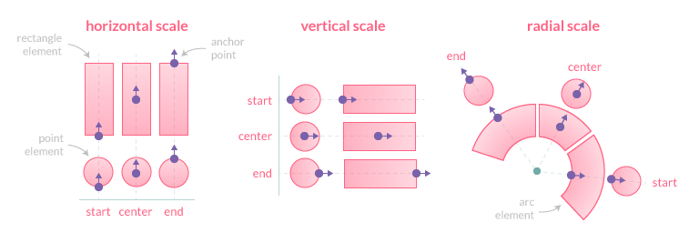
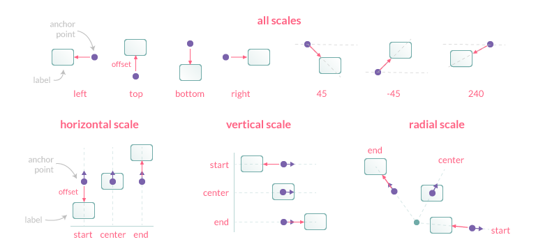
Anchoring
An anchor point is defined by an orientation vector and a position on the data element. The orientation depends on the scale type (vertical, horizontal or radial). The position is calculated based on the Anchor option and the orientation vector.
Supported values for Anchor:
CENTER(default): element centerSTART: lowest element boundaryEND: highest element boundary
Clamping
The clamp option, when true, enforces the anchor position to be calculated based on the visible geometry of the associated element (i.e. part inside the chart area).
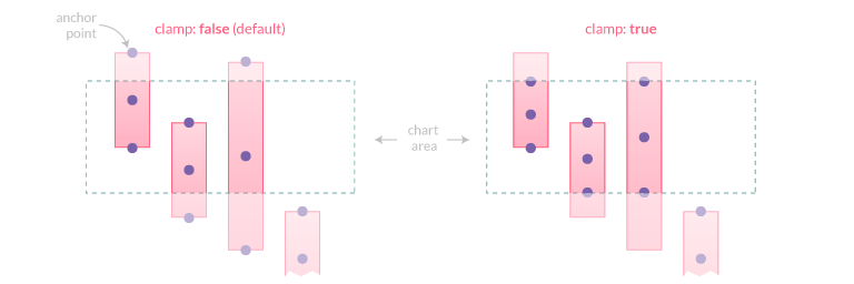
If the element is fully hidden (i.e. entirely outside the chart area), anchor points will not be adjusted and thus will also be outside the viewport.
Alignment and Offset
The Align option defines the position of the label relative to the anchor point position and orientation. Its value can be expressed either by a number representing the clockwise angle (in degree) or by one of the following string presets:
CENTER(default): the label is centered on the anchor pointSTART: the label is positioned before the anchor point, following the same directionEND: the label is positioned after the anchor point, following the same directionRIGHT: the label is positioned to the right of the anchor point (0)BOTTOM: the label is positioned to the bottom of the anchor point (90)LEFT: the label is positioned to the left of the anchor point (180)TOP: the label is positioned to the top of the anchor point (270)
The offset represents the distance (in pixels) to pull the label away from the anchor point. This option is not applicable when Align is CENTER'. Also note that if Align is START, the label is moved in the opposite direction. The default value is 4.
Rotation
This option controls the clockwise rotation angle (in degrees) of the label, the rotation center point being the label center. The default value is 0 (no rotation).
Visibility
The Display option controls the visibility of labels and accepts the following values:
TRUE(default): the label is drawnFALSE: the label is hiddenAUTO: the label is hidden if it overlaps with another label
Overlap
The Display is the option can be used to prevent overlapping labels, based on the following rules when two labels overlap:
- if both labels are
TRUE, they will be drawn overlapping - if both labels are
AUTO, the one with the highest data index will be hidden. If labels are at the same data index, the one with the lowest dataset index will be hidden - if one label is
TRUEand the other one isAUTO, the one withAUTOwill be hidden (whatever the data/dataset indices)
Labels with FALSE don't contribute to the overlap detection.
Clipping
When the clip option is true, the part of the label which is outside the chart area will be masked.
Formatting
Every label will be drawn with a default behavior. This can be overridden thanks to the formatter option and a formatter callback.
// creates plugin options
DataLabelsOptions options = new DataLabelsOptions();
// sets formatter callback
option.setFormatter(new FormatterCallback(){

    /**
     * Returns the formatted label value.
     *
     * @param context plugin context instance
     * @param dataItem value container to be formatted.
     * @return the label value to be showed
     */
   @Override
   public String invoke(DataLabelsContext context, DataItem dataItem){
      // your logic
      return formettedValue;
   }
});
The DataItem argument is a wrapper to the possible values that a dataset can contain:
- doubles.
- strings.
- FloatingData, available only for BAR dataset instances.
- DataPoint.
Multiple lines of labels text
Labels can be displayed on multiple lines by using the newline character (\n) between each line or by providing an array of strings where each item represents a new line.
Example:
// creates plugin options
DataLabelsOptions options = new DataLabelsOptions();
// sets formatter callback
option.setFormatter(new FormatterCallback(){

   @Override
   public String invoke(DataLabelsContext context, DataItem dataItem){
      StringBuffer sb = new StringBuffer();
      sb.append("line1").append('\n').append("line2").append('\n').append(dataItem.getValue());
      return sb.toString();
   }
});
The space between each line can be adjusted using the font lineHeight option.
Text Alignment
The textAlign option only applies to multiple line labels and specifies the text alignment being used when drawing the label text. Note that right-to-left text detection based on the current locale is not currently implemented.
Supported values for TextAlign:
START(default): the text is left-alignedCENTER: the text is centeredEND: the text is right-alignedLEFT: alias ofSTARTRIGHT: alias ofEND
Listeners element
Every options has got a inner element to set listener handlers.
// creates plugin options
DataLabelsOptions options = new DataLabelsOptions();
// sets "enter" event handler
option.getListeners().setEnterEventHandler(new EnterEventHandler(){

   @Override
   public boolean onEnter(DataLabelsContext context, ChartEventContext event){
      IsChart chart = context.getChart();
      chart.getCanvas().getElement().getStyle().setCursorType(CursorType.POINTER);
      return true;
   }
});
// sets "leave" event handler
option.getListeners().setLeaveEventHandler(new LeaveEventHandler(){

   @Override
   public boolean onLeave(DataLabelsContext context, ChartEventContext event){
      IsChart chart = context.getChart();
      chart.getCanvas().getElement().getStyle().setCursorType(CursorType.DEFAULT);
      return true;
   }
});
The listeners element allows to register callbacks to be notified when an event is detected on a specific label. This option is an object where the property is the type of the event to listen and the value is a callback with the context and event arguments.
The context contains the same information as for other callbacks, can be modified (e.g. add new options, by context.setOptions method) and thus, if the callback explicitly returns true, the label is updated with the new context and the chart re-rendered. This allows to implement visual interactions with labels such as highlight, selection, etc.
Listeners can be registered for any label at chart level or for labels of a specific dataset.
If no listener is registered, incoming events are immediately ignored, preventing extra computation such as intersecting label bounding box. That means there should be no performance penalty for configurations that don't use events.
Events
This plugin currently supports the following label events and interface to be implemented:
| Name | Charba events | Description |
|---|---|---|
| enter | mousemove | the mouse is moved over a label. See EnterEventHandler |
| leave | mousemove | the mouse is moved out of a label. See LeaveEventHandler |
| click | click | the mouse's primary button is pressed and released on a label. See ClickEventHandler |
Charba event that need to be enabled in order to get the associated label event working.
Charba provides an abstract handler implementation with all interfaces (AbstractEventHandler) which can be extended, only with needed methods, and add easily as following:
// creates plugin options
DataLabelsOptions options = new DataLabelsOptions();
// sets event handlers
options.setListenersHandler(new AbstractEventHandler(){

    // overrides methods

});
Options builder
Charba provides a builder to create options using the set methods in sequence and get the options object at the end of configuration.
// creates plugin options
DataLabelsOptions options = DataLabelsOptionsBuilder.create()
    .setAlign(Align.center)
    .setBackgroundColor(new ColorCallback<DataLabelsContext>(){

       @Override
       public IsColor invoke(DataLabelsContext context){
          IsChart chart = context.getChart();
          List<Dataset> datasets = chart.getData().getDatasets();
          LineDataset dataset = (LineDataset)datasets.get(context.getDatasetIndex());
          return dataset.getBackgroundColor();
       }
    }).build();
// stores plugin options to the chart
chart.getOptions().getPlugins().setOptions(DataLabelsPlugin.ID, options);
Creating a build by DataLabelsOptionsBuilder.create() it will use the global options as default, instead by DataLabelsOptionsBuilder.create(chart) it will use the global chart options as default.
Out-of-the-box implementations
Charba provides some callbacks implementations, developed for common purposes.
Cursor handler
Charba provides a common listener handler for listener to change the cursor type when the labels are clickable.
To apply the handler, you can set an instance to the plugin options, as following:
// creates plugin options
DataLabelsOptions options = new DataLabelsOptions();
// creates the handler instance
// uses the CursorType.POINTER
DataLabelsPointerHandler handler = new DataLabelsPointerHandler();
// sets the handler
options.setListenersHandler(handler);
The handler can be customized at constructor level, setting which cursor must be used hovering the labels, as following:
// creates the handler instance
// uses the CursorType.POINTER
DataLabelsPointerHandler handler = new DataLabelsPointerHandler();
// creates the handler instance
// uses the CursorType.CROSSHAIR
DataLabelsPointerHandler handler = new DataLabelsPointerHandler(CursorType.CROSSHAIR);
Selection handler
Charba provides a common listener handler for listener to invoke data set selection handlers if there were defined. The handler accepts DatasetSelectionEventHandler instances in order to notify which data set has been selected clicking on the label.
To apply a callback, you can set an instance to the plugin options, as following:
// creates plugin options
DataLabelsOptions options = new DataLabelsOptions();
// creates the handler instance
DataLabelsSelectionHandler handler = new DataLabelsSelectionHandler();
// adds the handler
handler.addDatasetSelectionEventHandler(new DatasetSelectionEventHandler(){

    /**
     * Invoked when the user clicks on the chart to select a data set.
     *
     * @param event chart data set selection event
     */
    @Override
    public void onSelect(DatasetSelectionEvent event){
        // logic
    }
});

DataLabelsOptions options = new DataLabelsOptions();
options.setListenersHandler(handler);
Against to the data set selection event handler, at chart level, this invocation is synchronous.
The handler can be customized at constructor level, setting which cursor must be used hovering the labels, as following:
// creates the handler instance
// uses the CursorType.POINTER
DataLabelsSelectionHandler handler = new DataLabelsSelectionHandler();
// creates the handler instance
// uses the CursorType.CROSSHAIR
DataLabelsSelectionHandler handler = new DataLabelsSelectionHandler(CursorType.CROSSHAIR);
Percentage formatter
Charba provides a common callback for formatter in order to provide the percentage of the value for each data index per dataset.
To apply the callback, you can set an instance to the plugin options, as following:
// creates plugin options
DataLabelsOptions options = new DataLabelsOptions();
// creates the callback
PercentageCallback callback = new PercentageCallback();
// sets the callback as formatter
options.setFormatter(callback);
The handler can be customized at constructor level, setting:
- decimal precision, in order to have a good number of decimal digits of percentage to show. Default is 2;
- stacked, as boolean argument, in order to calculate the percentage on the total of the dataset (
false) or using the same data index of stacked datasets (true). Default isfalse.