Bar chart
(quoted from Bar chart definition in Wikipedia)
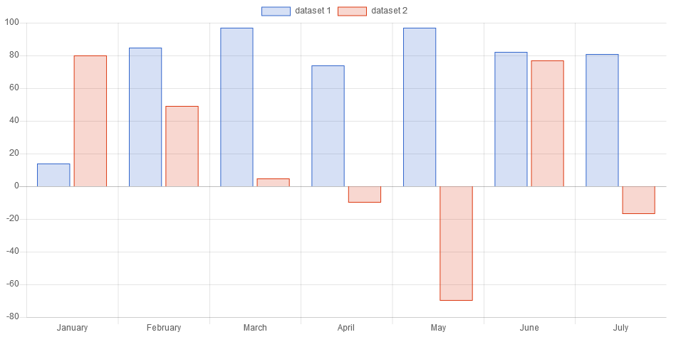
A bar chart is a chart that presents categorical data with rectangular bars with heights or lengths proportional to the values that they represent. The bars can be plotted vertically or horizontally.
A bar chart shows comparisons among discrete categories. One axis of the chart shows the specific categories being compared, and the other axis represents a measured value. Some bar charts present bars clustered in groups of more than one, showing the values of more than one measured variable.
Programmatically, you could use a bar chart as following:
// creates the chart
BarChart chart = new BarChart();
// adds to DOM
component.add(chart);
...
// example for Elemental2
// gets the chart instance as DOM element
Element element = chart.getChartElement().as();
// adds to DOM
DomGlobal.document.body.appendChild(element);
By UIBinder (ONLY for GWT), you could use a bar chart as following:
<ui:UiBinder xmlns:ui="urn:ui:com.google.gwt.uibinder"
   xmlns:g="urn:import:com.google.gwt.user.client.ui"
   xmlns:c="urn:import:org.pepstock.charba.client.gwt.widgets">

   <g:HTMLPanel  width="100%">
      ....
      <c:BarChartWidget ui:field="chart"/>
      ...
   </g:HTMLPanel>
</ui:UiBinder>
Dataset
The bar chart allows to define the data and a number of properties, used to display the data, by a bar dataset.
Every chart has got a method to create a typed dataset accordingly with the chart type. The dataset can be also created instantiating the constructor.
// creates the chart
BarChart chart = new BarChart();
// creates the dataset
BarDataset dataset = chart.newDataset();
// sets the option
dataset.setBackgroundColor(HtmlColor.RED);
...
// creates the dataset
BarDataset datasetNew = new BarDataset();
// sets the option
datasetNew.setBackgroundColor(HtmlColor.RED);
...
// sets the datasets to the chart
chart.getData().setDatasets(dataset, datasetNew);
The following are the attributes that you can set:
| Name | Type | Scriptable | Description |
|---|---|---|---|
| autoInflateAmount | boolean | - | If true, the amount of pixels to inflate the bar rectangles, when drawing, is automatically calculating. |
| base | double - double[] | Yes | Base value for the bar in data units along the value axis. |
| backgroundColor | String[] - IsColor[] - Pattern[] - Gradient[] | Yes | The fill color/pattern of the bar. |
| barPercentage | double | - | The percent (0-1) of the available width each bar should be within the category width. 1.0 will take the whole category width and put the bars right next to each other. |
| barThickness | int | - | The width of each bar in pixels. |
| borderColor | String[] - IsColor[] - Gradient[] | Yes | The color of the bar border. |
| borderSkipped | boolean - BorderSkipped | Yes | Which edge to skip drawing the border for. |
| borderRadius | int[] - BarBorderRadius[] | Yes | The bar border radius (in pixels). |
| borderWidth | int[] - BarBorderWidth[] | Yes | The stroke width of the bar in pixels. |
| categoryPercentage | double | - | The percent (0-1) of the available width each category should be within the sample width. |
| clip | boolean - double - Clip | - | How to clip relative to chart area. Positive value allows overflow, negative value clips that many pixels inside chart area. When set to 0 means clip at chart area. |
| enableBorderRadius | boolean | Yes | If true, it only shows the border radius of a bar when the bar is at the end of the stack. |
| grouped | boolean | - | Should the bars be grouped on index axis. When true, all the datasets at same index value will be placed next to each other centering on that index value.When false, each bar is placed on its actual index-axis value. |
| hoverBackgroundColor | String[] - IsColor[] - Pattern[] - Gradient[] | Yes | The fill color/pattern of the bars when hovered. |
| hoverBorderColor | String[] - IsColor[] - Gradient[] | Yes | The stroke color of the bars when hovered. |
| hoverBorderWidth | int[] | Yes | The stroke width of the bars when hovered. |
| hoverBorderRadius | int[] - BarBorderRadius[] | Yes | The bar border radius (in pixels) when hovered. |
| indexAxis | IndexAxis | - | The base axis of the dataset. 'IndexAxis.X' for vertical bars and 'IndexAxis.Y' for horizontal bars. |
| inflateAmount | int[] | Yes | The amount of pixels to inflate the bar rectangles, when drawing. |
| label | String | - | The label for the dataset which appears in the legend and tooltips. |
| maxBarThickness | int | - | The maximum bar thickness, to ensure that bars are not sized thicker than this. |
| minBarLength | int | - | Set this to ensure that bars have a minimum length in pixels. |
| normalized | boolean | - | If true, you provide data with indices that are unique, sorted, and consistent across data sets and provide the normalized. |
| order | int | - | The drawing order of dataset. Also affects order for stacking, tooltip, and legend. |
| pointStyle | PointStyle - Img - Canvas | Yes | Point style for legend. |
| parsing | boolean | - | If false, the data set parsing is disable. If parsing is disabled, data must be sorted and in the formats the associated chart type and scales use internally. |
| xAxisID | String | - | The ID of the x axis to plot this dataset on. |
| yAxisID | String | - | The ID of the y axis to plot this dataset on. |
General
The general options for a bar dataset can control behaviors not related to styling or interactions and they are the following:
| Name | Defaults | Description |
|---|---|---|
| clip | Undefined.DOUBLE | How to clip relative to chart area. |
| indexAxis | IndexAxis.X | The base axis of the dataset. |
| label | null | The label for the dataset which appears in the legend and tooltips. |
| normalized | false | If true, you provide data with indices that are unique, sorted, and consistent across data sets and provide the normalized. |
| order | 0 | The drawing order of dataset. Also affects order for stacking, tooltips, and legend. |
| parsing | true | If false, the data set parsing is disable. If parsing is disabled, data must be sorted and in the formats the associated chart type and scales use internally. |
| xAxisID | DefaultScaleId.X | The ID of the x axis to plot this dataset on. |
| yAxisID | DefaultScaleId.Y | The ID of the y axis to plot this dataset on. |
Styling
The style of each bar of the dataset can be configured by the following properties:
| Name | Description |
|---|---|
| backgroundColor | The fill color of the bar. |
| base | Base value for the bar in data units along the value axis. |
| borderColor | The color of the bar border. |
| borderSkipped | Which edge to skip drawing the border for. |
| borderRadius | The bar border radius (in pixels). |
| borderWidth | The stroke width of the bar in pixels. |
| enableBorderRadius | If true, it only shows the border radius of a bar when the bar is at the end of the stack. |
| inflateAmount | This option can be used to inflate the rects that are used to draw the bars. This can be used to hide artifacts between bars when (barPercentage * categoryPercentage) is equals to 1. |
| pointStyle | Point style for legend. |
All above options have got the fallback to the associated Bar element, retrievable by the following statements:
// from chart instance
Bar bar = chart.getOptions().getElements().getBar();
// sets options for all bar datasets of the chart
bar.setBorderRadius(6);
...
// from defaults
Bar defaultBar  = Defaults.get().getGlobal().getElements().getBar();
// sets options for all bar datasets of all charts
defaultBar.setBorderRadius(6);
Interactions
The interactions can change the styling of each bar of the dataset which can set by the following properties:
| Name | Description |
|---|---|
| hoverBackgroundColor | The fill color of the bars when hovered. |
| hoverBorderColor | The stroke color of the bars when hovered. |
| hoverBorderRadius | The bar border radius (in pixels) when hovered. |
| hoverBorderWidth | The stroke width of the bars when hovered. |
All above options have got the fallback to the associated Bar elements, retrievable by the following statements:
// from chart instance
Bar bar = chart.getOptions().getElements().getBar();
// sets options for all bar datasets of the chart
bar.setHoverBorderRadius(6);
...
// from defaults
Bar defaultBar  = Defaults.get().getGlobal().getElements().getBar();
// sets options for all bar datasets of all charts
defaultBar.setHoverBorderRadius(6);
Scriptable
Scriptable options at dataset level accept a callback which is called for each of the underlying data values. See more details in Configuring charts section.
// creates chart
BarChart chart = new BarChart();
// creates dataset
BarDataset dataset = chart.newDataset();
// sets the option by a callback
dataset.setBackgroundColor(new ColorCallback<DatasetContext>(){

   @Override
   public IsColor invoke(DatasetContext context){
      // logic
      return color;
   }
});
The following options can be set by a callback:
| Name | Callback | Returned types |
|---|---|---|
| base | BaseCallback | double |
| backgroundColor | ColorCallback<DatasetContext> | String - IsColor - Pattern - Gradient |
| borderColor | ColorCallback<DatasetContext> | String - IsColor - Gradient |
| borderSkipped | BorderSkippedCallback | BorderSkipped |
| borderRadius | BorderRadiusCallback<DatasetContext> | int - BarBorderRadius |
| borderWidth | BarBorderWidthCallback | int - BarBorderWidth |
| enableBorderRadius | EnableBorderRadiusCallback | boolean |
| hoverBackgroundColor | ColorCallback<DatasetContext> | String - IsColor - Pattern - Gradient |
| hoverBorderColor | ColorCallback<DatasetContext> | String - IsColor - Gradient |
| hoverBorderWidth | BarBorderWidthCallback | int - BarBorderWidth |
| hoverBorderRadius | BorderRadiusCallback<DatasetContext> | int - BarBorderRadius |
| inflateAmount | InflateAmountCallback | int(1) |
| pointStyle | PointStyleCallback<DatasetContext> | boolean - PointStyle - Img - Canvas |
(1)To enable autoInflateAmount by the inflate amount callback, the value to return must be Undefined.INTEGER.
Configuration
The bar chart accepts specific configuration not related to the styling or interactions which can be manage by the following options:
| Name | Description |
|---|---|
| barPercentage | The percent (0-1) of the available width each bar should be within the category width. 1.0 will take the whole category width and put the bars right next to each other. |
| barThickness | The width of each bar in pixels. |
| categoryPercentage | The percent (0-1) of the available width each category should be within the sample width. |
| grouped | Should the bars be grouped on index axis. When true, all the datasets at same index value will be placed next to each other centering on that index value.When false, each bar is placed on its actual index-axis value. |
| maxBarThickness | The maximum bar thickness, to ensure that bars are not sized thicker than this. |
| minBarLength | Set this to ensure that bars have a minimum length in pixels. |
All above options have got the fallback to the associated Datasets elements which enables to define common values of the options for all bar datasets of the chart of globally, as following:
// from chart instance
Datasets datasets = chart.getOptions().getDatasets();
// sets options for all bar datasets of the chart
datasets.setBarPercentage(0.7);
...
// from defaults
Datasets defaultDatasets  = Defaults.get().getGlobal().getDatasets();
// sets options for all bar datasets of all charts
defaultDatasets.setBarPercentage(0.7);
Data structure
The data of a dataset for a bar chart can be passed in two formats.
Data as doubles
When the data is an array or list of doubles, the x axis is generally a category. The points are placed onto the axis using their position in the array. When a bar chart is created with a category axis, the labels property of the data object must be specified.
// sets data as an array of doubles
dataset.setData(1,2,3,4,6);

// sets data as a list of double
List<Double> list = new LinkedList<>();
list.add(1);
list.add(2);
list.add(3);
dataset.setData(list);
Data as DataPoint
You can also specify the dataset when using the time series charts. Each data point is specified using an object containing y and x (as time type) properties for time series.
// creates a datapoint
DataPoint dp1 = new DataPoint();
dp1.setY(10);
dp1.setX(new Date());
// creates a datapoint
DataPoint dp2 = new DataPoint();
dp2.setY(30);
dp2.setX(new Date());
// sets data by an array of datapoints
dataset.setDataPoint(dp1, dp2);
Floating bars
You can also specify the dataset for a bar chart as list of floating bar data or by an array of arrays of doubles. This will force rendering of bars with the start and the end point of a bar respectively.
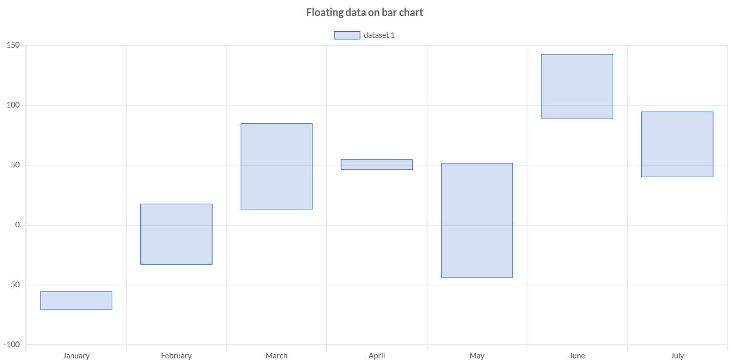
// sets in the constructor
FloatingData fd1 = new FloatingData(10, 30);
// sets by method to update values
FloatingData fd2 = new FloatingData();
fd2.setValues(-10, 60)
// stores the data to dataset
dataset.setFloatingData(fd1, fd2);
Options
The bar chart defines specific options implementation to be configured. These options are merged with the global chart configuration options to form the options passed to the chart.
// creates the chart
BarChart chart = new BarChart();
// gets the chart options
BarOptions options = chart.getOptions();
// sets options
options.setResponsive(true);
options.setSkipNull(true);
These are the options specific to bar charts:
| Name | Type | Default | Description |
|---|---|---|---|
| skipNull | boolean | true | If true, NaN values will not be drawn. |