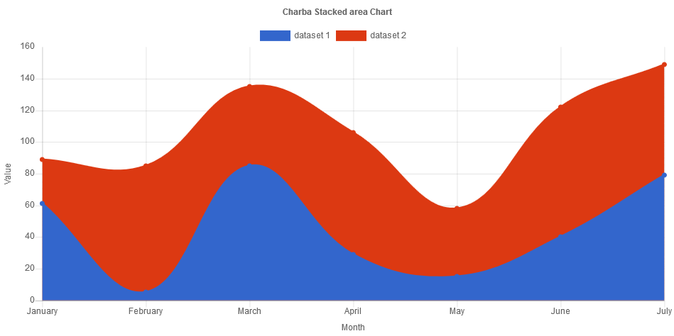
Stacked Area chart
A stacked area chart is a way of plotting data points on a filled line. Often, it is used to show trend data, or the comparison of two data sets.
Programmatically, you could use a stacked area chart as following:
// creates the chart
StackedAreaChart chart = new StackedAreaChart();
// adds to DOM
component.add(chart);
...
// example for Elemental2
// gets the chart instance as DOM element
Element element = chart.getChartElement().as();
// adds to DOM
DomGlobal.document.body.appendChild(element);
By UIBinder (ONLY for GWT), you could use a stacked area chart as following:
<ui:UiBinder xmlns:ui="urn:ui:com.google.gwt.uibinder"
   xmlns:g="urn:import:com.google.gwt.user.client.ui"
   xmlns:c="urn:import:org.pepstock.charba.client.gwt.widgets">

   <g:HTMLPanel  width="100%">
      ....
      <c:StackedAreaChartWidget ui:field="chart"/>
      ...
   </g:HTMLPanel>
</ui:UiBinder>
Dataset
The stacked area chart allows a number of properties to be specified for each stacked area dataset. These are used to set display properties for a specific dataset.
Every chart has got a method to create a typed dataset accordingly with the chart type. The dataset can be also created instantiating the constructor.
// creates the chart
StackedAreaChart chart = new StackedAreaChart();
// creates the dataset
StackedAreaDataset dataset = chart.newDataset();
// sets the option
dataset.setBackgroundColor(HtmlColor.RED);
...
// creates the dataset
StackedAreaDataset datasetNew = new StackedAreaDataset();
// sets the option
datasetNew.setBackgroundColor(HtmlColor.RED);
...
// sets the datasets to the chart
chart.getData().setDatasets(dataset, datasetNew);
The following are the attributes that you can set:
| Name | Type | Scriptable | Description |
|---|---|---|---|
| backgroundColor | String - IsColor - Pattern - Gradient | Yes | The fill color/pattern under the line. |
| borderCapStyle | CapStyle | Yes | Cap style of the line. See MDN. |
| borderColor | String - IsColor - Gradient | Yes | The color of the line. |
| borderDash | int[] | Yes | Length and spacing of dashes. See MDN. |
| borderDashOffset | double | Yes | Offset for line dashes. See MDN. |
| borderJoinStyle | JoinStyle | Yes | Line joint style. See MDN. |
| borderWidth | int | Yes | The width of the line in pixels. |
| cubicInterpolationMode | CubicInterpolationMode | Yes | Algorithm used to interpolate a smooth curve from the discrete data points. |
| clip | boolean - double - Clip | - | How to clip relative to chart area. Positive value allows overflow, negative value clips that many pixels inside chart area. |
| hoverBackgroundColor | String - IsColor - Pattern - Gradient | Yes | The fill color/pattern under the line, when hovered. |
| hoverBorderCapStyle | CapStyle | Yes | Cap style of the line, when hovered. See MDN. |
| hoverBorderColor | String - IsColor - Gradient | Yes | The color of the line, when hovered. |
| hoverBorderDash | int[] | Yes | Length and spacing of dashes, when hovered. See MDN. |
| hoverBorderDashOffset | int | Yes | Offset for line dashes, when hovered. See MDN. |
| hoverBorderJoinStyle | JoinStyle | Yes | Line joint style, when hovered. See MDN. |
| hoverBorderWidth | int | Yes | The width of the line in pixels, when hovered. |
| indexAxis | IndexAxis | - | The base axis of the dataset. 'IndexAxis.X' for horizontal lines and 'IndexAxis.Y' for vertical lines. |
| label | String | - | The label for the dataset which appears in the legend and tooltips. |
| normalized | boolean | - | If true, you provide data with indices that are unique, sorted, and consistent across data sets and provide the normalized. |
| order | int | - | The drawing order of dataset. Also affects order for stacking, tooltip, and legend. |
| parsing | boolean | - | If false, the data set parsing is disable. If parsing is disabled, data must be sorted and in the formats the associated chart type and scales use internally. |
| pointBackgroundColor | String[] - IsColor[] - Gradient[] | Yes | The fill color for points. |
| pointBorderColor | String[] - IsColor[] - Gradient[] | Yes | The border color for points. |
| pointBorderWidth | int[] | Yes | The width of the point border in pixels. |
| pointHitRadius | double[] | Yes | The pixel size of the non-displayed point that reacts to mouse events. |
| pointHoverBackgroundColor | String[] - IsColor[] - Gradient[] | Yes | Point background color when hovered. |
| pointHoverBorderColor | String[] - IsColor[] - Gradient[] | Yes | Point border color when hovered. |
| pointHoverBorderWidth | int[] | Yes | Border width of point when hovered. |
| pointHoverRadius | double[] | Yes | The radius of the point when hovered. |
| pointRadius | double[] | Yes | The radius of the point shape. If set to 0, the point is not rendered. |
| pointRotation | double[] | Yes | The rotation of the point in degrees. |
| pointStyle | PointStyle[] - Img[] - Canvas[] | Yes | Style of the point. |
| showLine | boolean | - | If false, the line is not drawn for this dataset. |
| spanGaps | boolean - double | - | If true, lines will be drawn between points with no or null data. If false, points with NaN data will create a break in the line. Can also be a number specifying the maximum gap length to span. The unit of the value depends on the scale used. |
| stepped | Stepped | - | If the line is shown as a stepped line. |
| tension | double | - | Bezier curve tension of the line. Set to 0 to draw straight lines. This option is ignored if monotone cubic interpolation is used. |
| xAxisID | String | - | The ID of the x axis to plot this dataset on. |
| yAxisID | String | - | The ID of the y axis to plot this dataset on. |
General
The general options for a stacked area dataset can control behaviors not related to styling or interactions and they are the following:
| Name | Defaults | Description |
|---|---|---|
| clip | Undefined.DOUBLE | How to clip relative to chart area. |
| indexAxis | IndexAxis.X | The base axis of the dataset. |
| label | null | The label for the dataset which appears in the legend and tooltips. |
| normalized | false | If true, you provide data with indices that are unique, sorted, and consistent across data sets and provide the normalized. |
| order | 0 | The drawing order of dataset. Also affects order for stacking, tooltip, and legend. |
| parsing | true | If false, the data set parsing is disable. If parsing is disabled, data must be sorted and in the formats the associated chart type and scales use internally. |
| xAxisID | DefaultScaleId.X | The ID of the x axis to plot this dataset on. |
| yAxisID | DefaultScaleId.Y | The ID of the y axis to plot this dataset on. |
Point styling
The style of each point of the dataset can be configured by the following properties:
| Name | Description |
|---|---|
| pointBackgroundColor | The fill color for points. |
| pointBorderColor | The border color for points. |
| pointBorderWidth | The width of the point border in pixels. |
| pointHitRadius | The pixel size of the non-displayed point that reacts to mouse events. |
| pointRadius | The radius of the point shape. |
| pointRotation | The rotation of the point in degrees. |
| pointStyle | Style of the point. |
All above options have got the fallback to the associated Point elements, retrievable by the following statements:
// from chart instance
Point point = chart.getOptions().getElements().getPoint();
// sets options for all line datasets of the chart
point.setRadius(6);
...
// from defaults
Point defaultPoint  = Defaults.get().getGlobal().getElements().getPoint();
// sets options for all line datasets of all charts
defaultPoint.setRadius(6);
Line styling
The style of each line of the dataset can be configured by the following properties:
| Name | Description |
|---|---|
| backgroundColor | The fill color under the line. |
| borderCapStyle | Cap style of the line. |
| borderColor | The color of the line. |
| borderDash | Length and spacing of dashes. |
| borderDashOffset | Offset for line dashes. |
| borderJoinStyle | Line joint style |
| borderWidth | The width of the line in pixels. |
| cubicInterpolationMode | Algorithm used to interpolate a smooth curve from the discrete data points. |
| stepped | If the line is shown as a stepped line. |
| tension | Bezier curve tension of the line. |
All above options have got the fallback to the associated Line elements, retrievable by the following statements:
// from chart instance
Line line = chart.getOptions().getElements().getLine();
// sets options for all line datasets of the chart
line.setBorderWidth(6);
...
// from defaults
Line defaultLine  = Defaults.get().getGlobal().getElements().getLine();
// sets options for all line datasets of all charts
defaultLine.setBorderWidth(6);
Point interactions
The interaction with each point can be controlled with the following properties:
| Name | Description |
|---|---|
| pointHoverBackgroundColor | Point background color when hovered. |
| pointHoverBorderColor | Point border color when hovered. |
| pointHoverBorderWidth | Border width of point when hovered. |
| pointHoverRadius | The radius of the point when hovered. |
All above options have got the fallback to the associated Point elements, retrievable by the following statements:
// from chart instance
Point point = chart.getOptions().getElements().getPoint();
// sets options for all line datasets of the chart
point.setRadius(6);
...
// from defaults
Point defaultPoint  = Defaults.get().getGlobal().getElements().getPoint();
// sets options for all line datasets of all charts
defaultPoint.setRadius(6);
Line interactions
The interaction with each line can be controlled with the following properties:
| Name | Description |
|---|---|
| hoverBackgroundColor | The fill color under the line, when hovered. |
| hoverBorderCapStyle | Cap style of the line, when hovered. |
| hoverBorderColor | The color of the line, when hovered. |
| hoverBorderDash | Length and spacing of dashes, when hovered. |
| hoverBorderDashOffset | Offset for line dashes, when hovered. |
| hoverBorderJoinStyle | Line joint style, when hovered. |
| hoverBorderWidth | The width of the line in pixels, when hovered. |
All above options have got the fallback to the associated Line elements, retrievable by the following statements:
// from chart instance
Line line = chart.getOptions().getElements().getLine();
// sets options for all line datasets of the chart
line.setBorderWidth(6);
...
// from defaults
Line defaultLine  = Defaults.get().getGlobal().getElements().getLine();
// sets options for all line datasets of all charts
defaultLine.setBorderWidth(6);
Scriptable
Scriptable options at dataset level accept a callback which is called for each of the underlying data values. See more details in Configuring charts section.
// creates chart
StackedAreaChart chart = new StackedAreaChart();
// creates dataset
StackedAreaDataset dataset = chart.newDataset();
// sets the option by a callback
dataset.setBackgroundColor(new ColorCallback<DatasetContext>(){

   @Override
   public IsColor invoke(DatasetContext context){
      // logic
      return color;
   }
});
The following options can be set by a callback:
| Name | Callback | Returned types |
|---|---|---|
| backgroundColor | ColorCallback<DatasetContext> | String - IsColor - Pattern - Gradient |
| borderCapStyle | CapStyleCallback<DatasetContext> | CapStyle |
| borderColor | ColorCallback<DatasetContext> | String - IsColor - Gradient |
| borderDash | BorderDashCallback<DatasetContext> | List<Integer> |
| borderDashOffset | BorderDashOffsetCallback<DatasetContext> | double |
| borderJoinStyle | JoinStyleCallback<DatasetContext> | JoinStyle |
| borderWidth | WidthCallback<DatasetContext> | int |
| cubicInterpolationMode | CubicInterpolationModeCallback | CubicInterpolationMode |
| hoverBackgroundColor | ColorCallback<DatasetContext> | String - IsColor - Pattern - Gradient |
| hoverBorderCapStyle | CapStyleCallback<DatasetContext> | CapStyle |
| hoverBorderColor | ColorCallback<DatasetContext> | String - IsColor - Gradient |
| hoverBorderDash | BorderDashCallback<DatasetContext> | List<Integer> |
| hoverBorderDashOffset | BorderDashOffsetCallback<DatasetContext> | int |
| hoverBorderJoinStyle | JoinStyleCallback<DatasetContext> | JoinStyle |
| hoverBorderWidth | WidthCallback<DatasetContext> | int |
| pointBackgroundColor | ColorCallback<DatasetContext> | String - IsColor - Gradient |
| pointBorderColor | ColorCallback<DatasetContext> | String - IsColor - Gradient |
| pointBorderWidth | WidthCallback<DatasetContext> | int |
| pointHitRadius | RadiusCallback<DatasetContext> | double |
| pointHoverBackgroundColor | ColorCallback<DatasetContext> | String - IsColor - Gradient |
| pointHoverBorderColor | ColorCallback<DatasetContext> | String - IsColor - Gradient |
| pointHoverBorderWidth | WidthCallback<DatasetContext> | int |
| pointHoverRadius | RadiusCallback<DatasetContext> | double |
| pointRadius | RadiusCallback<DatasetContext> | double |
| pointRotation | RotationCallback<DatasetContext> | double |
| pointStyle | PointStyleCallback<DatasetContext> | boolean - PointStyle - Img - Canvas |
Data structure
The data of a dataset for a stacked area chart are passed by an array or list of doubles and the x axis is generally a category. When a stacked area chart is created with a category axis, the labels property of the data object must be specified.
// sets data as an array of doubles
dataset.setData(1,2,3,4,6);

// sets data as a list of double
List<Double> list = new LinkedList<>();
list.add(1);
list.add(2);
list.add(3);
dataset.setData(list);
Options
The stacked area chart specific options implementation to be configured. These options are merged with the global chart configuration options to form the options passed to the chart.
// creates chart
StackedAreaChart chart = new StackedAreaChart();
// gets the chart options
StackedLineOptions options = chart.getOptions();
// sets option
options.setResponsive(true);