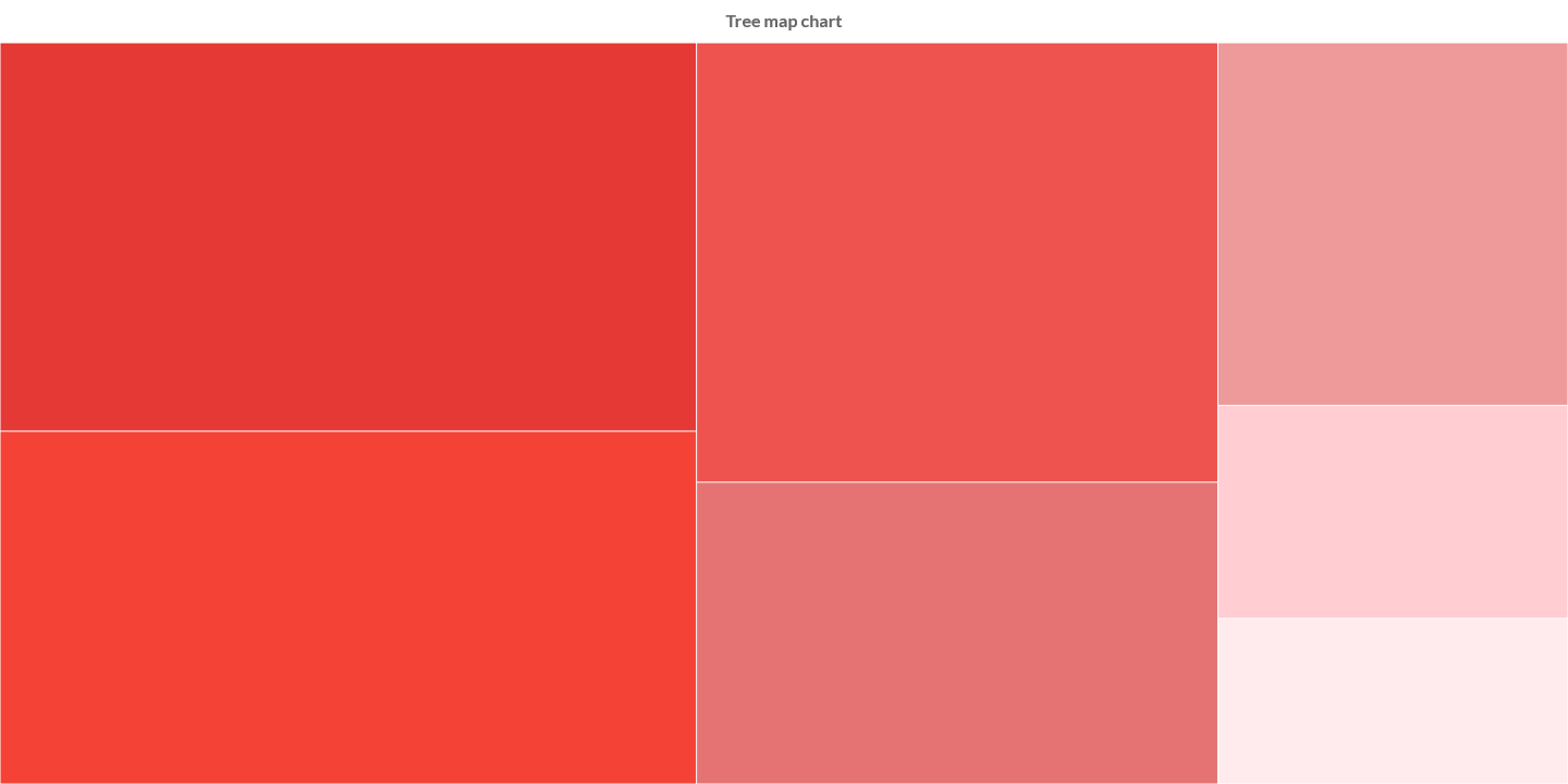
TreeMap chart
(quoted from Treemap chart definition in Wikipedia)
In information visualization and computing, treemapping is a method for displaying hierarchical data using nested figures, usually rectangles.
Treemaps display hierarchical (tree-structured) data as a set of nested rectangles. Each branch of the tree is given a rectangle, which is then tiled with smaller rectangles representing sub-branches. A leaf node's rectangle has an area proportional to a specified dimension of the data. Often the leaf nodes are colored to show a separate dimension of the data.
When the color and size dimensions are correlated in some way with the tree structure, one can often easily see patterns that would be difficult to spot in other ways, such as whether a certain color is particularly relevant. A second advantage of treemaps is that, by construction, they make efficient use of space. As a result, they can legibly display thousands of items on the screen simultaneously.
Charba provides out of the box the feature to enable treemap chart, leveraging on Chart.js Treemap.
The Chart.js Treemap is native javascript implementation and Charba provides the wrapper in order to be able to use it.
Programmatically, you could use a bar chart as following:
// creates the chart
TreeMapChart chart = new TreeMapChart();
// adds to DOM
component.add(chart);
...
// example for Elemental2
// gets the chart instance as DOM element
Element element = chart.getChartElement().as();
// adds to DOM
DomGlobal.document.body.appendChild(element);
By UIBinder (ONLY for GWT), you could use a bar chart as following:
<ui:UiBinder xmlns:ui="urn:ui:com.google.gwt.uibinder"
   xmlns:g="urn:import:com.google.gwt.user.client.ui"
   xmlns:c="urn:import:org.pepstock.charba.client.gwt.widgets">

   <g:HTMLPanel  width="100%">
      ....
      <c:TreeMapChartWidget ui:field="chart"/>
      ...
   </g:HTMLPanel>
</ui:UiBinder>
Controller registration
The controller registration is performed when a first TREEMP chart has been instantiated. When there is a use case where some defaults options must be set before the first instantiation, you need to register the controller before changing the default options.
// registers the controller
TreeMapChart.register();
// gets default options
GlobalOptions gOptions = Defaults.get().getGlobal();
// gets default matrix element options
TreeMapElementOptions defaultOptions = gOptions.getElements().getElement(TreeMapElementOptions.FACTORY);
// sets default value
defaultOptions.setBorderColor(HtmlColor.RED);
Dataset
The treemap chart allows to define the data and a number of properties, used to display the data, by a treemap dataset.
Every chart has got a method to create a typed dataset accordingly with the chart type. The dataset can be also created instantiating the constructor.
// creates the chart
TreeMapChart chart = new TreeMapChart();
// creates the dataset
TreeMapDataset dataset = chart.newDataset();
// sets the option
dataset.setBackgroundColor(HtmlColor.RED);
...
// creates the dataset
TreeMapDataset datasetNew = new TreeMapDataset();
// sets the option
datasetNew.setBackgroundColor(HtmlColor.RED);
...
// sets the dataset to the chart
chart.getData().setDatasets(dataset);
The following are the attributes that you can set:
| Name | Type | Default | Scriptable | Description |
|---|---|---|---|---|
| backgroundColor | String - IsColor - Pattern - Gradient | Defaults.get().getGlobal().getBackgroundColorAsString() | Yes | The fill color/pattern of the treemap element. |
| borderColor | String - IsColor - Gradient | Defaults.get().getGlobal().getBorderColorAsString() | Yes | The color of the treemap element border. |
| borderRadius | int - BarBorderRadius | 0 | Yes | The radius of the rectangle of treemap element (in pixels). |
| borderWidth | int | 0 | - | The stroke width of the treemap element in pixels. |
| groups | String[] - Key[] | - | Set the properties names of the tree object to group by the data. | |
| hoverBackgroundColor | String - IsColor - Pattern - Gradient | Defaults.get().getGlobal().getBackgroundColorAsString() | Yes | The fill color/pattern of the treemap elements when hovered. |
| hoverBorderColor | String - IsColor - Gradient | Defaults.get().getGlobal().getBorderColorAsString() | Yes | The stroke color of the treemap elements when hovered. |
| hoverBorderWidth | int | 0 | - | The stroke width of the treemap elements when hovered. |
| key | String - Key | null | - | Set the property name of the tree object to use to get the value of the data. |
| rtl | boolean | false | - | Set true for rendering the treemap elements from right to left. |
| spacing | double | 0.5 | - | Fixed distance between all treemap elements. |
| sumKeys | String[] - Key[] | - | Set the properties names of the tree object to define multiple keys to add additional sums, on top of the key one. | |
| treeLeafKey | String - Key | "_leaf" | - | The name of the key where the object key of leaf node of tree object is stored. Used only when tree is an object, as hierarchical data. |
Scriptable
Scriptable options at dataset level accept a callback which is called for each of the underlying data values. See more details in Configuring charts section.
// creates chart
TreeMapChart chart = new TreeMapChart();
// creates dataset
TreeMapDataset dataset = chart.newDataset();
// sets the option by a callback
dataset.setBackgroundColor(new ColorCallback<DatasetContext>(){

   @Override
   public IsColor invoke(DatasetContext context){
      // logic
      return color;
   }
});
The following options can be set by a callback:
| Name | Callback | Returned types |
|---|---|---|
| backgroundColor | ColorCallback<DatasetContext> | String - IsColor - Pattern - Gradient |
| borderColor | ColorCallback<DatasetContext> | String - IsColor - Gradient |
| borderRadius | BorderRadiusCallback<DatasetContext> | int - BarBorderRadius |
| hoverBackgroundColor | ColorCallback<DatasetContext> | String - IsColor - Pattern - Gradient |
| hoverBorderColor | ColorCallback<DatasetContext> | String - IsColor - Gradient |
Labels
The labels options can control if and how a label, to represent the data, can be shown in the rectangle.
// creates chart
TreeMapChart chart = new TreeMapChart();
// creates dataset
TreeMapDataset dataset = chart.newDataset();
// gets labels
Labels labels = dataset.getLabels();
// labels must be enabled
labels.setDisplay(true);
// sets font and color of labels
labels.setColor(HtmlColor.WHITE);
labels.getFont().setFamily("Tahoma");
labels.getFont().setSize(10);
The following are the attributes that you can set:
| Name | Type | Default | Scriptable | Description |
|---|---|---|---|---|
| align | Align | Align.LEFT | Yes | Specifies the text horizontal alignment used when drawing the label. |
| color | String[] - IsColor[] | HtmlColor.TRANSPARENT | Yes | Color of label. See default colors. |
| display | boolean | false | - | If true, the labels will be applied to the elements. |
| font | IsFont - List<FontItem> - FontItem[] | Defaults.get().getGlobal().getFont() | Yes | Font of text of label. See Font. |
| formatter | FormatterCallback | null | Yes | Scriptable options to enable custom formatting for the label text to show. |
| hoverColor | String[] - IsColor[] | HtmlColor.TRANSPARENT` | Yes | Color of label, when hovered. See default colors. |
| hoverFont | IsFont - List<FontItem> - FontItem[] | Defaults.get().getGlobal().getFont() | Yes | Font of text of label, when hovered. See Font. |
| overflow | Overflow | Overflow.CUT | Yes | The overflow property controls what happens to a label that is too big to fit into a rectangle. |
| padding | int | 3 | - | Specifies the space, in pixels, to apply around labels. |
| position | Position | Position.MIDDLE | Yes | Specifies the text vertical alignment used when drawing the label. |
Fonts and colors
When the label to draw has multiple lines, you can use different font and color for each row of the label. This is enabled configuring an array or list of fonts or colors for those options. When the lines are more than the configured fonts of colors, the last configuration of those options is used for all remaining lines.
Label options scriptable
Scriptable options at labels level accept a callback which is called for each of the underlying data values. See more details in Configuring charts section.
// creates chart
TreeMapChart chart = new TreeMapChart();
// creates dataset
TreeMapDataset dataset = chart.newDataset();
// sets the labels option by a callback
dataset.getLabels().setColor(new ColorsCallback(){

   @Override
   public List<IsColor> invoke(DatasetContext context){
      // logic
      return colors;
   }
});
The following options can be set by a callback:
| Name | Callback | Returned types |
|---|---|---|
| align | AlignCallback | Align |
| color | ColorsCallback)<DatasetContext> | List<String> - List<IsColor> |
| font | FontsCallback<DatasetContext> | List<FontItem> |
| hoverColor | ColorsCallback)<DatasetContext> | List<String> - List<IsColor> |
| hoverFont | FontsCallback<DatasetContext> | List<FontItem> |
| overflow | OverflowCallback | Overflow |
| position | PositionCallback | Position |
Label Formatter
Data values are converted to string. If values are grouped, the value of the group and the value (as string) are shown.
This default behavior can be overridden by the formatter which is a FormatterCallback.
A formatter can return a string (for a single line) or a list of strings (for multiple lines, where each item represents a new line).
// creates chart
TreeMapChart chart = new TreeMapChart();
// creates dataset
TreeMapDataset dataset = chart.newDataset();
// sets the labels formatter
dataset.getLabels().setFormatter(new FormatterCallback(){

   @Override
   public List<String> invoke(DatasetContext context){
      // logic
      return myLabelText;
   }
});
Captions
The captions options can control if and how a captions, to represent the group of the chart, can be shown in the rectangle.
// creates chart
TreeMapChart chart = new TreeMapChart();
// creates dataset
TreeMapDataset dataset = chart.newDataset();
// gets captions
Captions captions = dataset.getCaptions();
// sets font and color of captions
captions.setColor(HtmlColor.WHITE);
captions.getFont().setFamily("Tahoma");
captions.getFont().setSize(10);
The following are the attributes that you can set:
| Name | Type | Default | Scriptable | Description |
|---|---|---|---|---|
| align | Align | Align.LEFT | Yes | Specifies the text horizontal alignment used when drawing the caption. |
| color | String - IsColor | HtmlColor.TRANSPARENT | Yes | Color of caption. See default colors. |
| display | boolean | true | - | If true, the captions will be applied to the elements. |
| font | IsFont | Defaults.get().getGlobal().getFont() | Yes | Font of text of caption. See Font. |
| formatter | FormatterCallback | null | Yes | Scriptable options to enable custom formatting for the caption text to show. |
| hoverColor | String - IsColor | HtmlColor.TRANSPARENT` | Yes | Color of caption, when hovered. See default colors. |
| hoverFont | IsFont | Defaults.get().getGlobal().getFont() | Yes | Font of text of caption, when hovered. See Font. |
| padding | int | 3 | - | Specifies the space, in pixels, to apply around captions. |
Caption options scriptable
Scriptable options at captions level accept a callback which is called for each of the underlying data values. See more details in Configuring charts section.
// creates chart
TreeMapChart chart = new TreeMapChart();
// creates dataset
TreeMapDataset dataset = chart.newDataset();
// sets the captions option by a callback
dataset.getCaptions().setColor(new ColorCallback<DatasetContext>(){

   @Override
   public IsColor invoke(DatasetContext context){
      // logic
      return color;
   }
});
The following options can be set by a callback:
| Name | Callback | Returned types |
|---|---|---|
| align | AlignCallback | Align |
| color | ColorCallback<DatasetContext> | String - IsColor |
| font | FontCallback<DatasetContext> | FontItem |
| hoverColor | ColorCallback<DatasetContext> | String - IsColor |
| hoverFont | FontCallback<DatasetContext> | FontItem |
Caption Formatter
If values are grouped, the value of the group is shown in the chart as caption for all elements belonging to the group.
This default behavior can be overridden by the formatter which is a FormatterCallback.
A formatter can return a string which represents the label text.
// creates chart
TreeMapChart chart = new TreeMapChart();
// creates dataset
TreeMapDataset dataset = chart.newDataset();
// sets the captions formatter
dataset.getCaptions().setFormatter(new FormatterCallback(){

   @Override
   public String invoke(DatasetContext context){
      // logic
      return myLabelText;
   }
});
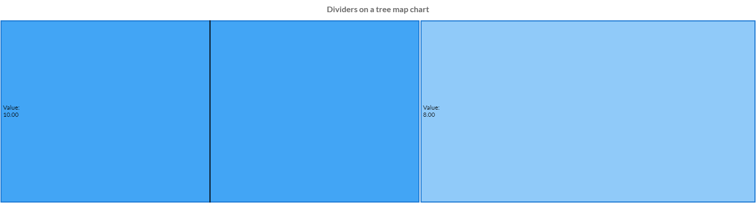
Dividers
The divider is a line which splits a treemap elements in grouped elements and can be controlled by some options.
// creates chart
TreeMapChart chart = new TreeMapChart();
// creates dataset
TreeMapDataset dataset = chart.newDataset();
// gets dividers
Dividers dividers = dataset.getDividers();
// dividers must be enabled
dividers.setDisplay(true);
// sets width and color of dividers
dividers.setLineColor(HtmlColor.BLACK);
dividers.setLineWidth(2);
The following are the attributes that you can set:
| Name | Type | Default | Scriptable | Description |
|---|---|---|---|---|
| display | boolean | false | - | If true, the labels will be applied to the elements. |
| lineCapStyle | CapStyle | CapStyle.BUTT | - | Cap style of the divider line. See MDN. |
| lineColor | String - IsColor | HtmlColor.BLACK - | - | The color of the divider line. |
| lineDash | int[] | [] | - | Length and spacing of dashes of the line. See MDN. |
| lineDashOffset | double | 0 | - | Offset for line dashes of the line. See MDN. |
| lineWidth | int | 1 | - | The stroke width of the line, in pixels. |
Data structure
The data of a dataset for a treemap chart can be passed in two formats. The data are automatically built, based on the tree data, provided by the users.
The setData and setDataPoints methods are available, inherited by the bar dataset, but you can NOT use them otherwise an exception will throw.
Use setTree, setTreeObjects, setTreeObject or setTreeNativeObject instead.
The getDataPoints methods is available and can provide a list of TreeMapDataPoint.
Data as doubles
A treemap dataset can contain the data as an array or list of doubles,
// creates chart
TreeMapChart chart = new TreeMapChart();
// creates dataset
TreeMapDataset dataset = chart.newDataset();
// sets data as an array of doubles
dataset.setTree(1,2,3,4,6);

// sets data as a list of double
List<Double> list = new LinkedList<>();
list.add(1);
list.add(2);
list.add(3);
dataset.setTree(list);
Data as objects
Tree data should be provided by a list of objects. Data is then automatically build. When the data are provided by objects, the key dataset property defines the key name in data objects to use for value, and the groups dataset property, as list of keys, can be provided to display multiple levels of hierarchy. When you need additional sums based on the data of the objects, the sumKeys dataset property, as list of keys, defines multiple keys to add additional sums, on top of the key one.
Data is summarized to groups internally.
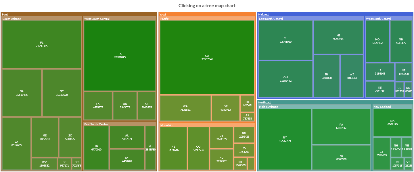
// list of TreeMapObject properties
private enum Property implements Key
{
    STATE("state"),
    CODE("code"),
    REGION("region"),
    DIVISION("division"),
    INCOME("income"),
    POPULATION("population"),
    AREA("area");

    private final String value;

    private Property(String value) {
        this.value = value;
    }

    @Override
    public String value() {
        return value;
    }
}
// tree objects type
private static class TreeMapObject extends NativeObjectContainer {

    private TreeMapObject(NativeObject nativeObject) {
        super(nativeObject);
    }
}
// creates the tree objects
List<TreeMapObject> objects = new LinkedList<>();
// creates or loads objects from external source
...
// creates chart
TreeMapChart chart = new TreeMapChart();
// creates dataset
TreeMapDataset dataset = chart.newDataset();
// sets data as an array of doubles
dataset.setTreeObjects(objects);
// sets the value by the key of the object
dataset.setKey(Property.POPULATION);
// sets the keys of the object to group by
dataset.setGroups(Property.REGION, Property.DIVISION, Property.CODE);
Options
The treemap chart defines specific options implementation to be configured.
// creates the chart
TreeMapChart chart = new TreeMapChart();
// gets the chart options
TreeMapOptions options = chart.getOptions();
// gets treemap element options
TreeMapElementOptions treemapOptions = options.getElements().getElement(TreeMapElementOptions.FACTORY);
// sets value
treemapOptions.setBorderColor(HtmlColor.RED);

// ------------------------
// DEFAULTS
// ------------------------
// gets default options
GlobalOptions gOptions = Defaults.get().getGlobal();
// gets default matrix element options
TreeMapElementOptions defaultOptions = gOptions.getElements().getElement(TreeMapElementOptions.FACTORY);
// sets default value
defaultOptions.setBorderColor(HtmlColor.RED);
The treemap chart disables the LABELS, ANNOTATION, HTML legend and dataset items selector plugins.