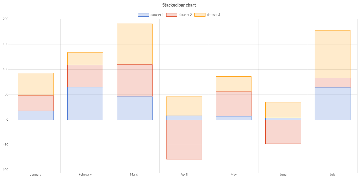
Stacked Bar chart
Stacked bar charts can be configured like bar charts and changes the settings on the X and Y axes to enable stacking. Stacked bar charts can be used to show how one data series is made up of a number of smaller pieces.
Programmatically, you could use a bar chart as following:
// creates the chart
StackedBarChart chart = new StackedBarChart();
// adds to DOM
component.add(chart);
...
// example for Elemental2
// gets the chart instance as DOM element
Element element = chart.getChartElement().as();
// adds to DOM
DomGlobal.document.body.appendChild(element);
By UIBinder (ONLY for GWT), you could use a bar chart as following:
<ui:UiBinder xmlns:ui="urn:ui:com.google.gwt.uibinder"
   xmlns:g="urn:import:com.google.gwt.user.client.ui"
   xmlns:c="urn:import:org.pepstock.charba.client.gwt.widgets">

   <g:HTMLPanel  width="100%">
      ....
      <c:StackedBarChartWidget ui:field="chart"/>
      ...
   </g:HTMLPanel>
</ui:UiBinder>
Dataset
The stacked bar chart allows a number of properties to be specified for each stacked bar dataset. These are used to set display properties for a specific dataset.
Every chart has got a method to create a typed dataset accordingly with the chart type. The dataset can be also created instantiating the constructor.
// creates the chart
StackedBarChart chart = new StackedBarChart();
// creates the dataset
StackedBarDataset dataset = chart.newDataset();
// sets the option
dataset.setBackgroundColor(HtmlColor.RED);
...
// creates the dataset
StackedBarDataset datasetNew = new StackedBarDataset();
// sets the option
datasetNew.setBackgroundColor(HtmlColor.RED);
...
// sets the datasets to the chart
chart.getData().setDatasets(dataset, datasetNew);
The following are the attributes that you can set:
| Name | Type | Scriptable | Description |
|---|---|---|---|
| base | double - double[] | Yes | Base value for the bar in data units along the value axis. |
| backgroundColor | String[] - IsColor[] - Pattern[] - Gradient[] | Yes | The fill color/pattern of the bar. |
| barPercentage | double | - | The percent (0-1) of the available width each bar should be within the category width. 1.0 will take the whole category width and put the bars right next to each other. |
| barThickness | int | - | The width of each bar in pixels. |
| borderColor | String[] - IsColor[] - Gradient[] | Yes | The color of the bar border. |
| borderSkipped | boolean - BorderSkipped | Yes | Which edge to skip drawing the border for. |
| borderRadius | int[] - BarBorderRadius[] | Yes | The bar border radius (in pixels). |
| borderWidth | int[] - BarBorderWidth[] | Yes | The stroke width of the bar in pixels. |
| categoryPercentage | double | - | The percent (0-1) of the available width each category should be within the sample width. |
| clip | boolean - double - Clip | - | How to clip relative to chart area. Positive value allows overflow, negative value clips that many pixels inside chart area. When set to 0 means clip at chart area. |
| enableBorderRadius | boolean | - | If true, it only shows the border radius of a bar when the bar is at the end of the stack. |
| grouped | boolean | - | Should the bars be grouped on index axis. When true, all the datasets at same index value will be placed next to each other centering on that index value.When false, each bar is placed on its actual index-axis value. |
| hoverBackgroundColor | String[] - IsColor[] - Pattern[] - Gradient[] | Yes | The fill color/pattern of the bars when hovered. |
| hoverBorderColor | String[] - IsColor[] - Gradient[] | Yes | The stroke color of the bars when hovered. |
| hoverBorderWidth | int[] | Yes | The stroke width of the bars when hovered. |
| hoverBorderRadius | int[] - BarBorderRadius[] | Yes | The bar border radius (in pixels) when hovered. |
| label | String | - | The label for the dataset which appears in the legend and tooltips. |
| maxBarThickness | int | - | The maximum bar thickness, to ensure that bars are not sized thicker than this. |
| minBarLength | int | - | Set this to ensure that bars have a minimum length in pixels. |
| normalized | boolean | - | If true, you provide data with indices that are unique, sorted, and consistent across data sets and provide the normalized. |
| order | int | - | The drawing order of dataset. Also affects order for stacking, tooltip, and legend. |
| parsing | boolean | - | If false, the data set parsing is disable. If parsing is disabled, data must be sorted and in the formats the associated chart type and scales use internally. |
| pointStyle | PointStyle - Img - Canvas | Yes | Point style for legend. |
| xAxisID | String | - | The ID of the x axis to plot this dataset on. |
| yAxisID | String | - | The ID of the y axis to plot this dataset on. |
General
The general options for a stacked bar dataset can control behaviors not related to styling or interactions and they are the following:
| Name | Defaults | Description |
|---|---|---|
| clip | Undefined.DOUBLE | How to clip relative to chart area. |
| indexAxis | IndexAxis.X | The base axis of the dataset. |
| label | null | The label for the dataset which appears in the legend and tooltips. |
| normalized | false | If true, you provide data with indices that are unique, sorted, and consistent across data sets and provide the normalized. |
| order | 0 | The drawing order of dataset. Also affects order for stacking, tooltips, and legend. |
| parsing | true | If false, the data set parsing is disable. If parsing is disabled, data must be sorted and in the formats the associated chart type and scales use internally. |
| xAxisID | DefaultScaleId.X | The ID of the x axis to plot this dataset on. |
| yAxisID | DefaultScaleId.Y | The ID of the y axis to plot this dataset on. |
Styling
The style of each bar of the dataset can be configured by the following properties:
| Name | Description |
|---|---|
| backgroundColor | The fill color of the bar. |
| base | Base value for the bar in data units along the value axis. |
| borderColor | The color of the bar border. |
| borderSkipped | Which edge to skip drawing the border for. |
| borderRadius | The bar border radius (in pixels). |
| borderWidth | The stroke width of the bar in pixels. |
| enableBorderRadius | If true, it only shows the border radius of a bar when the bar is at the end of the stack. |
| pointStyle | Point style for legend. |
All above options have got the fallback to the associated Bar element, retrievable by the following statements:
// from chart instance
Bar bar = chart.getOptions().getElements().getBar();
// sets options for all bar datasets of the chart
bar.setBorderRadius(6);
...
// from defaults
Bar defaultBar  = Defaults.get().getGlobal().getElements().getBar();
// sets options for all bar datasets of all charts
defaultBar.setBorderRadius(6);
Interactions
The interactions can change the styling of each bar of the dataset which can set by the following properties:
| Name | Description |
|---|---|
| hoverBackgroundColor | The fill color of the bars when hovered. |
| hoverBorderColor | The stroke color of the bars when hovered. |
| hoverBorderRadius | The bar border radius (in pixels) when hovered. |
| hoverBorderWidth | The stroke width of the bars when hovered. |
All above options have got the fallback to the associated Bar elements, retrievable by the following statements:
// from chart instance
Bar bar = chart.getOptions().getElements().getBar();
// sets options for all bar datasets of the chart
bar.setHoverBorderRadius(6);
...
// from defaults
Bar defaultBar  = Defaults.get().getGlobal().getElements().getBar();
// sets options for all bar datasets of all charts
defaultBar.setHoverBorderRadius(6);
Scriptable
Scriptable options at dataset level accept a callback which is called for each of the underlying data values. See more details in Configuring charts section.
// creates chart
BarChart chart = new BarChart();
// creates dataset
BarDataset dataset = chart.newDataset();
// sets the option by a callback
dataset.setBackgroundColor(new ColorCallback<DatasetContext>(){

   @Override
   public IsColor invoke(DatasetContext context){
      // logic
      return color;
   }
});
The following options can be set by a callback:
| Name | Callback | Returned types |
|---|---|---|
| base | BaseCallback | double |
| backgroundColor | ColorCallback<DatasetContext> | String - IsColor - Pattern - Gradient |
| borderColor | ColorCallback<DatasetContext> | String - IsColor - Gradient |
| borderSkipped | BorderSkippedCallback | BorderSkipped |
| borderRadius | BorderRadiusCallback<DatasetContext> | int - BarBorderRadius |
| borderWidth | BarBorderWidthCallback | int - BarBorderWidth |
| hoverBackgroundColor | ColorCallback<DatasetContext> | String - IsColor - Pattern - Gradient |
| hoverBorderColor | ColorCallback<DatasetContext> | String - IsColor - Gradient |
| hoverBorderWidth | BarBorderWidthCallback | int - BarBorderWidth |
| hoverBorderRadius | BorderRadiusCallback<DatasetContext> | int - BarBorderRadius |
| pointStyle | PointStyleCallback<DatasetContext> | boolean - PointStyle - Img - Canvas |
Data structure
When the data is an array or list of doubles, the x axis is generally a category. The points are placed onto the axis using their position in the array. When a stacked bar chart is created with a category axis, the labels property of the data object must be specified.
// sets data as an array of doubles
dataset.setData(1,2,3,4,6);

// sets data as a list of double
List<Double> list = new LinkedList<>();
list.add(1);
list.add(2);
list.add(3);
dataset.setData(list);
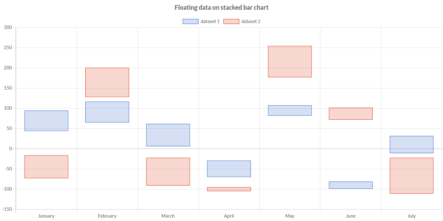
Floating bars
You can also specify the dataset for a bar chart as list of floating bar data or by an array of arrays of doubles. This will force rendering of bars with the start and the end point of a bar respectively.
...
// set in the constructor
FloatingData fd1 = new FloatingData(10, 30);
// set by method to update values
FloatingData fd2 = new FloatingData();
fd2.setValues(-10, 60)
// stores the data to dataset
dataset.setFloatingData(fd1, fd2);
Options
The stacked bar chart specific options implementation to be configured. These options are merged with the global chart configuration options to form the options passed to the chart.
To set the options at chart level, you can get a typed object accordingly with the chart type.
// creates the chart
StackedBarChart chart = new StackedBarChart();
// gets the chart options
StackedBarOptions options = chart.getOptions();
// sets options
options.setResponsive(true);
Axes
The chart is creating the default axes out-of-the-box, setting them as scaled. It defines a category axis for index, and a linear axis for values.
You can anyway override them setting your axes.
To access to predefined axes as following:
// gets category axis
CartesianCategoryAxis axis1 = (CartesianCategoryAxis) chart.getOptions().getScales().getAxisById(DefaultScaleId.X);
// sets axis options
axis1.setDisplay(true);
axis1.getTitle().setDisplay(true);
axis1.getTitle().setText("Index");
// gets linear axis
CartesianLinearAxis axis2 = (CartesianLinearAxis) chart.getOptions().getScales().getAxisById(DefaultScaleId.Y);
// sets axis options
axis2.setDisplay(true);
axis2.getTitle().setDisplay(true);
axis2.getTitle().setText("Value");
Horizontal bar
A stacked horizontal bar chart enables to have stacked data represented by horizontal bars.
Programmatically, you could use a stacked horizontal bar chart as following:
// creates the chart
StackedHorizontalBarChart chart = new StackedHorizontalBarChart();
// adds to DOM
component.add(chart);
...
// example for Elemental2
// gets the chart instance as DOM element
Element element = chart.getChartElement().as();
// adds to DOM
DomGlobal.document.body.appendChild(element);
By UIBinder (ONLY for GWT), you could use a line chart as following:
<ui:UiBinder xmlns:ui="urn:ui:com.google.gwt.uibinder"
   xmlns:g="urn:import:com.google.gwt.user.client.ui"
   xmlns:c="urn:import:org.pepstock.charba.client.gwt.widgets">

   <g:HTMLPanel  width="100%">
      ....
      <c:StackedHorizontalBarChartWidget ui:field="chart"/>
      ...
   </g:HTMLPanel>
</ui:UiBinder>
The stacked horizontal bar allows a number of properties to be specified for each stacked horizontal bar dataset. These are used to set display properties for a specific dataset.
The properties are the same of the stacked bar dataset.
Axes
The chart is creating the default axes out-of-the-box, setting them as scaled. It defines a category axis for index, and a linear axis for values.
You can anyway override them setting your axes.
To access to predefined axes as following:
// gets category axis as Y
CartesianCategoryAxis axis1 = (CartesianCategoryAxis) chart.getOptions().getScales().getAxisById(DefaultScaleId.Y);
// sets axis options
axis1.setDisplay(true);
axis1.getTitle().setDisplay(true);
axis1.getTitle().setText("Index");
// gets linear axis as X
CartesianLinearAxis axis2 = (CartesianLinearAxis) chart.getOptions().getScales().getAxisById(DefaultScaleId.X);
// sets axis options
axis2.setDisplay(true);
axis2.getTitle().setDisplay(true);
axis2.getTitle().setText("Value");